print, engraving
#
portrait
#
baroque
# print
#
figuration
#
line
#
history-painting
#
engraving
Dimensions: height 90 mm, width 54 mm
Copyright: Rijks Museum: Open Domain
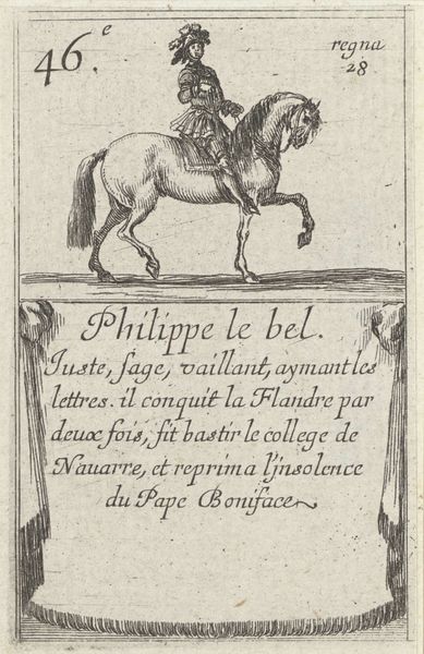
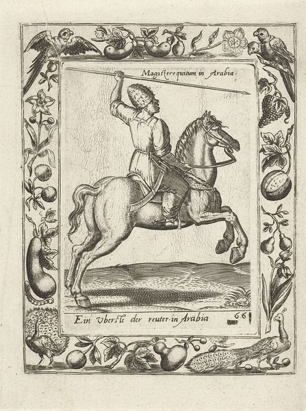
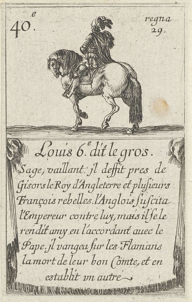
Editor: So this is Stefano della Bella's print, "Filips II," dating from between 1620 and 1664, at the Rijksmuseum. It's an engraving... it feels quite dynamic with all those lines creating movement. How do you read this piece formally? Curator: Focusing on the internal composition, one sees the commanding figure elevated and centrally placed. Note the density of line employed to create the body of the horse, versus the sparser lines implying landscape. Consider, then, how the cross-hatching adds volume and depth while the calligraphic line detailing renders a sense of movement, no? Editor: I see that. The hatching definitely gives weight, especially to the horse, which contrasts with the airiness above. But, doesn't that make the composition feel unbalanced, with so much visual weight on the lower half? Curator: Perhaps, but note also that the inscription block mirrors the pictorial space. This creates a formal echo – a balanced visual syntax through structured components. Isn't this carefully considered spatial distribution more critical than representational accuracy? Editor: I suppose I was expecting it to direct my gaze upward, but now I see the text is equally weighted in the structure of the image. It's like two distinct, but related, blocks. Curator: Precisely. It presents an equilibrium achieved through contrasting yet correspondent forms. It makes us reflect on the structure, on the syntax, and ultimately on the relationship of all elements within the artistic creation. Editor: I appreciate you pointing that out. It has opened my eyes to aspects of composition that I would have completely missed! Curator: Indeed, and recognizing how such balance serves as an important structuring element to the whole will now affect your future looking.
Comments
No comments
Be the first to comment and join the conversation on the ultimate creative platform.
More like this