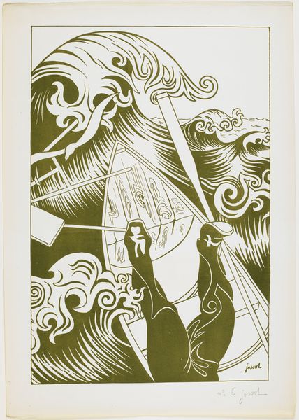
Reclamebiljet voor de Second International Antiquarian Book Fair te Los Angeles 1967
0:00
0:00
graphic-art, print, poster
#
graphic-art
#
blue ink drawing
#
narrative illustration
# print
#
book
#
old engraving style
#
landscape
#
figuration
#
personal sketchbook
#
food illustration
#
poster
Dimensions: height 410 mm, width 265 mm
Copyright: Rijks Museum: Open Domain
Curator: The texture of this poster, all in green ink, really draws me in. It's so evocative of the late 60s! Editor: Indeed, it has a distinctive aesthetic. What we're looking at is a 1967 advertising poster for the Second International Antiquarian Book Fair in Los Angeles. It was held at the Ambassador Hotel. Curator: What strikes me is how these two women, seemingly absorbed in their books, are also presented as figures within a broader cultural and intellectual landscape. Are they simply readers, or do they represent something more about women’s access to knowledge? Editor: Well, these figures absolutely reflect the period's aspirations toward intellectual engagement, specifically within the world of rare books. But the book fair itself also served a specific function: facilitating commerce and shaping cultural tastes. The Ambassador Hotel, where it took place, would have been a nexus for literary elites and collectors. Curator: It makes me think about how these fairs served as a microcosm of the cultural marketplace, impacting who gets to engage with history and knowledge. This poster presents such a gentle invitation, and yet access was clearly dictated by economics. Editor: Absolutely. Consider the socio-economic realities of the time. While the poster may project an image of widespread accessibility, attending such a fair and purchasing antique books was undoubtedly a privilege. We must think of that as an art historian, that power of imagery in marketing and accessibility to the population. Curator: It raises questions about the nature of collecting itself – the act of preservation and connoisseurship but also the exclusivity that often comes with it. I’m captivated by the simplicity, too—one color and an intriguing image; there's such an emphasis on design. Editor: And those design choices tell a story, don't they? It highlights the appeal of antiquarian books but frames it within the socio-economic context of Los Angeles in the 60s. Curator: Looking at this graphic, I’m reminded how design can function as an invitation but also as a potential barrier when considering its cultural and economic implications. Editor: Agreed. There's so much history embedded in seemingly simple advertisements.
Comments
No comments
Be the first to comment and join the conversation on the ultimate creative platform.
More like this