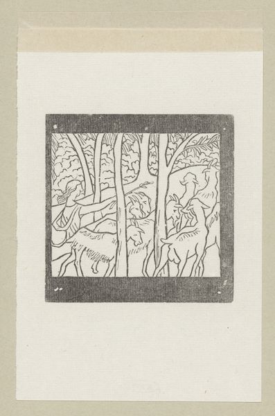
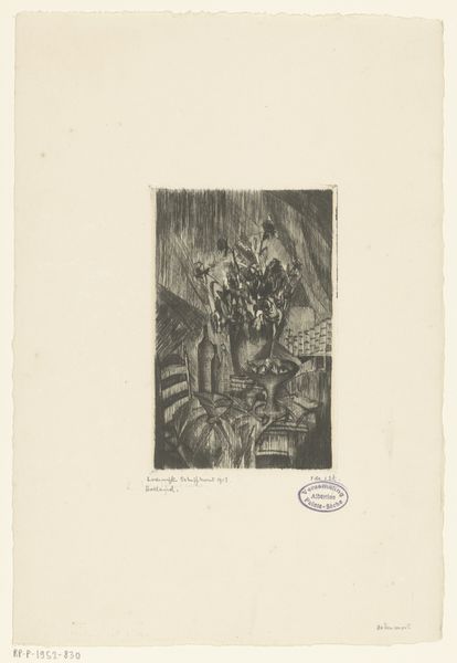
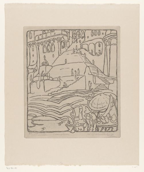
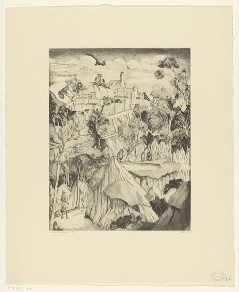
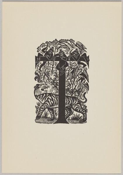
graphic-art, print, linocut, woodblock-print
#
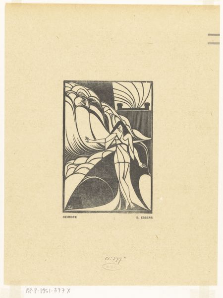
art-deco
#
graphic-art
#
aged paper
# print
#
linocut
#
old engraving style
#
woodcut effect
#
hand drawn type
#
landscape
#
figuration
#
personal sketchbook
#
linocut print
#
woodblock-print
#
pen work
#
sketchbook drawing
#
sketchbook art
#
coloring book page
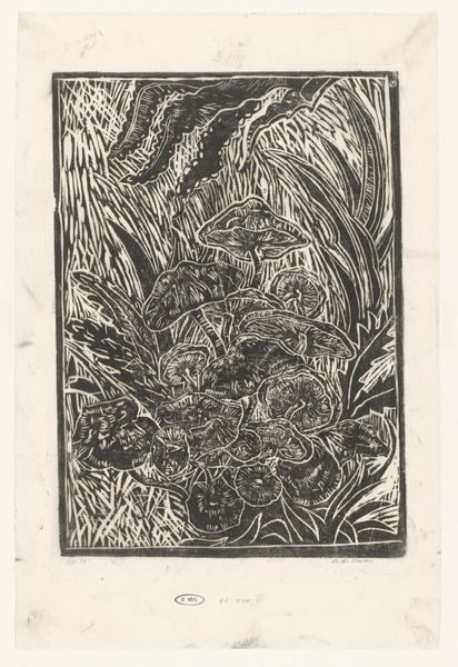
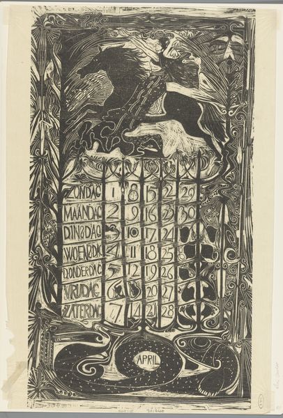
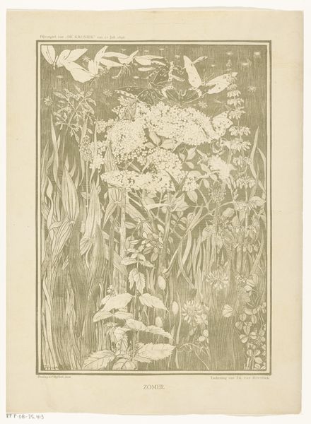
Dimensions: height 413 mm, width 302 mm
Copyright: Rijks Museum: Open Domain
Curator: Before us is "Kalenderblad voor september 1934 met vlinders op bloemen," or "Calendar Sheet for September 1934 with Butterflies on Flowers," created in 1933 by G.H. Bretschneider. It’s a graphic work, specifically a linocut print. Editor: My immediate impression is one of intricate simplicity. The black and white creates such a striking contrast, and the way the artist has captured the delicate nature of the butterflies and flowers with such bold lines is really captivating. Curator: Absolutely. This piece reflects a moment of rising social awareness and the intersection of art and daily life. The 1930s saw a rise in accessible art forms, like these calendar prints, reflecting everyday themes, catering to the masses rather than solely to an elite audience. Editor: Right. Butterflies, of course, carry such weight—symbols of transformation, rebirth, and even souls in many cultures. Placing them against the grid of the calendar adds another layer—the fleeting beauty of nature against the relentless march of time. Curator: The Art Deco influences are also very clear: stylized natural forms, geometric shapes even in organic designs. Bretschneider’s style fits into the trend of making everyday items aesthetically pleasing, almost propagandistic in its promotion of good design in daily life. Editor: Do you think the stark black and white enhances that sense of passing time and perhaps the solemn mood in Europe as war looms? Or am I reading too much into it? Curator: Not at all! The limitations inherent in linocut—the strong lines and areas of pure color—also communicate an urgency and lack of flourish that resonated with those austere times. While the natural subject matter seems carefree, there's an industrial edge to the process, too. Editor: Interesting how the artist chose to blend symbolism with utility. A lovely, fleeting reminder of simpler things amidst increasing uncertainties. Curator: Indeed, a visual artifact deeply interwoven with social and aesthetic values of its time. Editor: I'm drawn to the visual shorthand used to convey beauty. Makes me rethink the way images shape what we value as beauty across generations.
Comments
No comments
Be the first to comment and join the conversation on the ultimate creative platform.
More like this