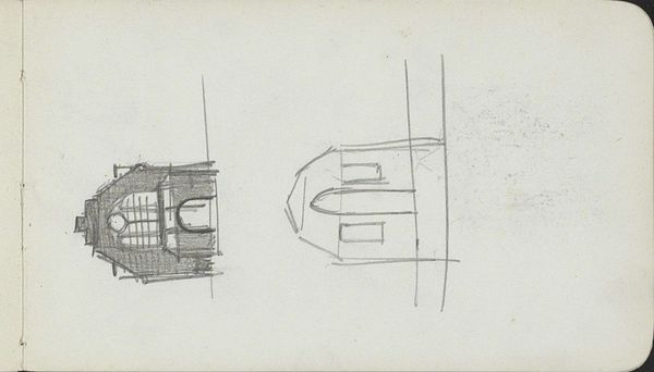
drawing, pencil
#
drawing
#
script typography
#
hand-lettering
#
lettering
#
playful lettering
#
hand drawn type
#
typography
#
hand lettering
#
figuration
#
hand-drawn typeface
#
geometric
#
pencil
#
typography style
#
modernism
#
small lettering
Copyright: Rijks Museum: Open Domain
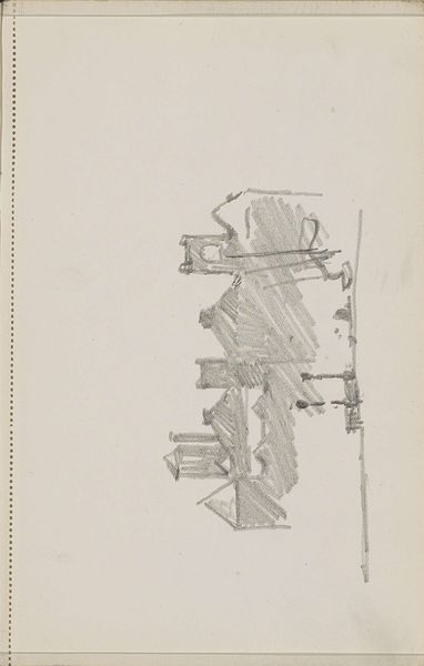
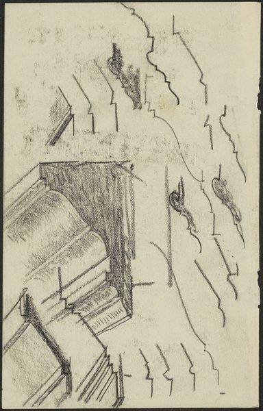
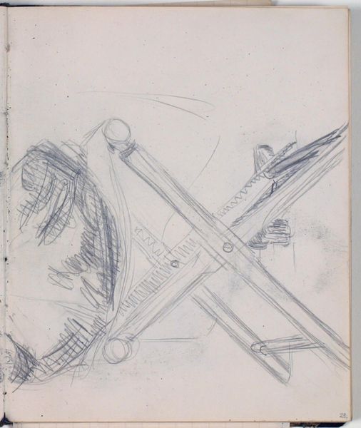
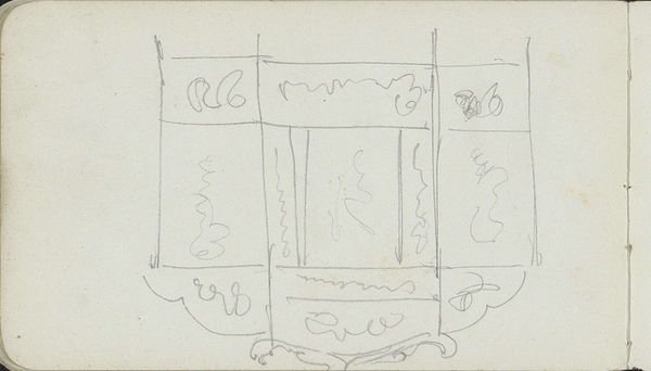
Editor: Here we have "Ornament met twee figuren met opgeheven armen," a pencil drawing by Carel Adolph Lion Cachet, created around 1928. It strikes me as a rather simple composition, almost architectural in its stark lines. What catches your eye in this piece? Curator: Immediately, I am drawn to the raw simplicity of line and form. The artist reduces the human figure to its most basic geometric components. Note the almost crude, yet deliberate, application of line; it creates a fascinating tension. Editor: Tension, how so? Curator: The imprecision hints at a dynamic energy. Observe how the parallel, diagonal lines give volume, yet also flatten the forms, denying a full three-dimensionality. Also note the figures themselves. They appear to be supporting something, trapped or constricted by the lines above. Is it an act of labour, performance, or entrapment? Editor: It’s interesting to consider that they are performing or entrapped...I initially didn't perceive any of that! I suppose I was focusing on the minimalist rendering. Do you think the lack of detail serves a purpose beyond pure aesthetics? Curator: Absolutely. The reduced forms force us to confront the basic structure. By minimizing details, the artist highlights the interplay between line, shape, and form, urging us to deconstruct our assumptions about representation. It asks what defines figuration at its very essence. The texture made by pencil is also visually intriguing, yes? Editor: It does add a certain texture to the drawing. This has been enlightening; thank you for offering a fresh perspective on form and composition! Curator: The pleasure was all mine; this simple drawing shows us the depth hidden in seemingly simple lines.
Comments
No comments
Be the first to comment and join the conversation on the ultimate creative platform.
More like this