graphic-art, print, engraving
#
portrait
#
graphic-art
#
16_19th-century
#
dutch-golden-age
# print
#
old engraving style
#
line
#
cityscape
#
engraving
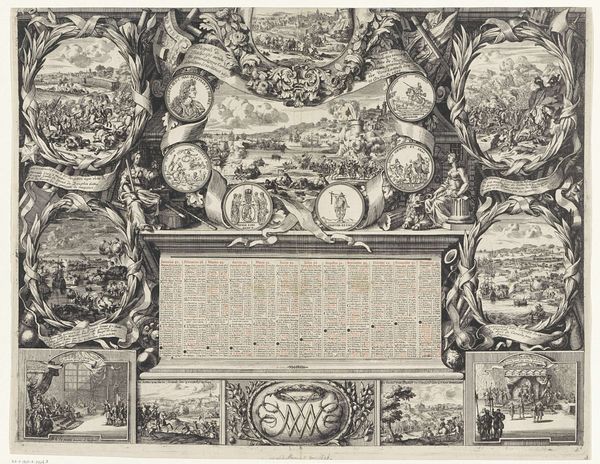
Dimensions: height 308 mm, width 428 mm
Copyright: Rijks Museum: Open Domain
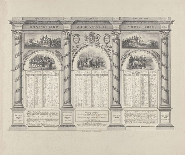
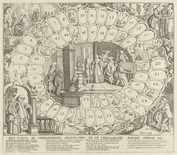
Editor: We’re looking at the “Nederlandsche Almanak 1837,” made in 1836. It’s an anonymous print at the Rijksmuseum. It is dense. Very, very dense. I'm a bit overwhelmed by all the information and decorative details vying for my attention. What should I be focusing on? Curator: Let’s consider the formal elements first. Disregard the almanac's functional purpose momentarily, and observe how the artist utilizes line and structure to create a visually engaging piece. Notice the architectural framework - the columns, the entablature, the overall symmetry. Editor: Yes, I see the symmetrical arrangement. The columns framing the calendar dates are quite prominent, aren’t they? They create a sort of visual rhythm, drawing the eye from top to bottom. Curator: Precisely. The artist uses the repetition of vertical lines to create a sense of order, contrasting with the dense text within. Examine how the ornamental details such as the portrait busts, landscapes and vignettes balance clarity and complexity within that order. Editor: The contrast is certainly there! I hadn’t really noticed how carefully the composition was constructed despite all the details. Are there other key components? Curator: Note the overall visual texture. The fineness of the engraving lends the surface a delicate quality. Consider also the contrast between the lighter areas and the darker, more densely engraved passages, and how that effects depth. Editor: So, it's the interplay of structure, line, and texture that really defines the work, regardless of the content it holds? Curator: Precisely. We see how careful distribution contributes to its overall effectiveness as an image, an organization of textual information but equally an intriguing graphic display. Editor: I now notice a more subtle beauty in its structural elements! I learned to appreciate form as a structure itself. Curator: And that keen attention to formal qualities enables a deeper level of meaning within the context of art making.
Comments
No comments
Be the first to comment and join the conversation on the ultimate creative platform.
More like this