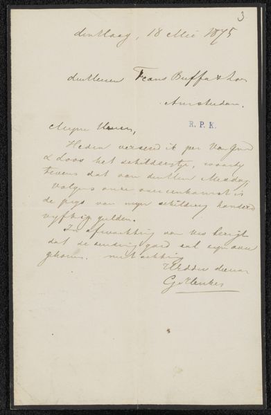
drawing, ink
#
drawing
#
ink
Copyright: Rijks Museum: Open Domain
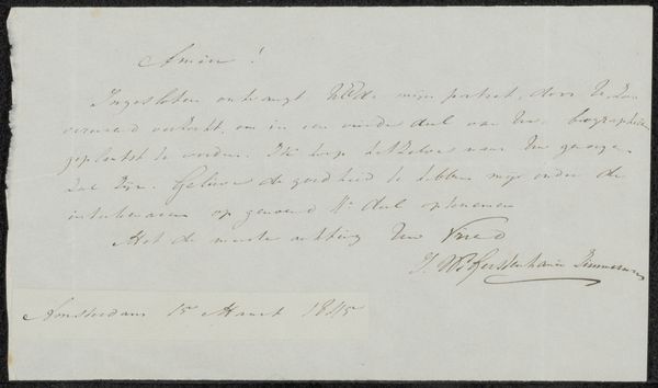
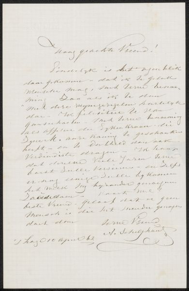
Curator: Here we have "Brief aan Christiaan Kramm," possibly from 1865, by Cornelis Steffelaar, an ink drawing on paper. The delicacy of the strokes immediately strikes me. What are your initial impressions? Editor: It feels very personal, like we’re intruding on a private moment. The script is beautiful, almost like an elaborate, tangled design in itself. What catches your eye in terms of the purely visual elements? Curator: Precisely. I observe the composition primarily as a interplay between positive and negative space, the dense, rhythmic character shapes are distributed in the composition to form visual balance, though imperfect in alignment to a pure horizontal and vertical orientation; I observe how Steffelaar handles the flow and interruption. What semiotic potential might reside in the imperfect horizontal and vertical orientation that results? Editor: I hadn't considered that aspect. Are you saying that even the letter's slant contributes to its meaning? Is Steffelaar hinting that the letter is written as an expressive medium of an expressive gesture of one friend toward another friend, not strictly constrained within a formal construct? Curator: It is my interpretation of its expression. Note too how he ends his letter with a dedication that frames it within a community: "a Friend en Kunstbroeder", one artist acknowledging kinship with the art world of the time. The letter becomes a semiotic device, referencing a tradition, while also enacting an individualized approach within that frame. It’s an eloquent comment. Editor: This exercise changed the way I think about what a piece means beyond the face value of its content. Thanks. Curator: Indeed. It brings me greater appreciation for Steffelaar's sophisticated eye and mind.
Comments
No comments
Be the first to comment and join the conversation on the ultimate creative platform.
More like this