drawing, paper, ink, pen
#
portrait
#
drawing
#
ink drawing
#
narrative-art
#
paper
#
ink
#
romanticism
#
pen
#
calligraphy
Copyright: Rijks Museum: Open Domain
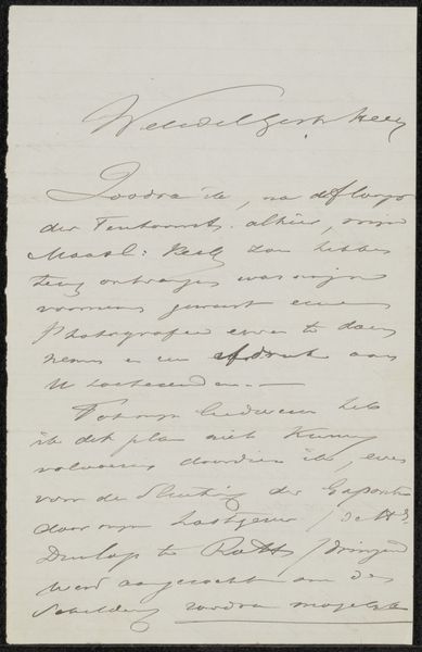
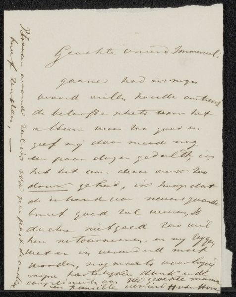
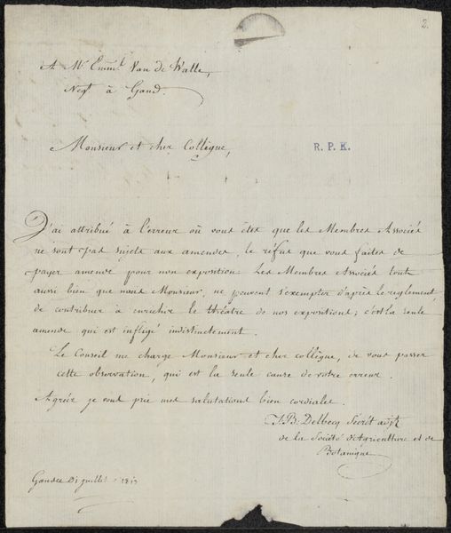
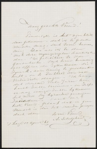
Editor: This is "Brief aan onbekend," or "Letter to an Unknown" by Tieleman Franciscus Suys, made sometime between 1793 and 1861. It's an ink drawing on paper. It looks quite delicate. The calligraphy gives it a unique visual texture. What do you see in this piece? Curator: The density of the marks across the page creates a fascinating interplay of light and shadow. Note the formal qualities of line, their curvature and weight, determine the rhythm. The rigid structure suggested by rows is broken by flourishes; the very materiality of the ink interacts with the paper's surface. Consider, too, how the blank spaces surrounding the text contribute to the overall composition; are these margins functional, or are they compositional choices in themselves? Editor: So you're focusing on the composition, how the artist arranged the marks and the paper. Are you suggesting the shapes of the negative space balance the marks, like another kind of language? Curator: Precisely. Furthermore, how does the evenness or unevenness of the ink contribute to a sense of balance and proportion? What effect do these textural differences produce? We could describe those formal qualities in any artwork. Editor: I see what you mean. By isolating the shapes and textures, we can appreciate this as more than just a message. I can apply this kind of thinking about shape, balance and materials more broadly, across media. Curator: Yes. Applying such visual analysis reveals more. Consider that even everyday pieces contain meaningful formal characteristics worth exploring and debating.
Comments
No comments
Be the first to comment and join the conversation on the ultimate creative platform.
More like this