About this artwork
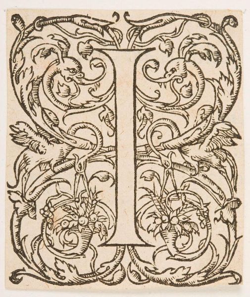
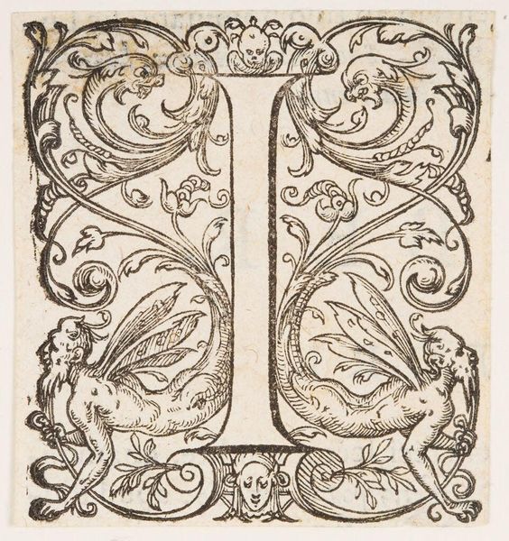
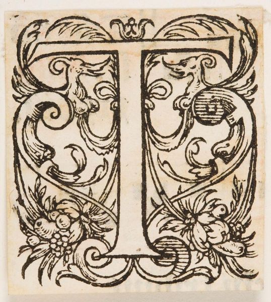
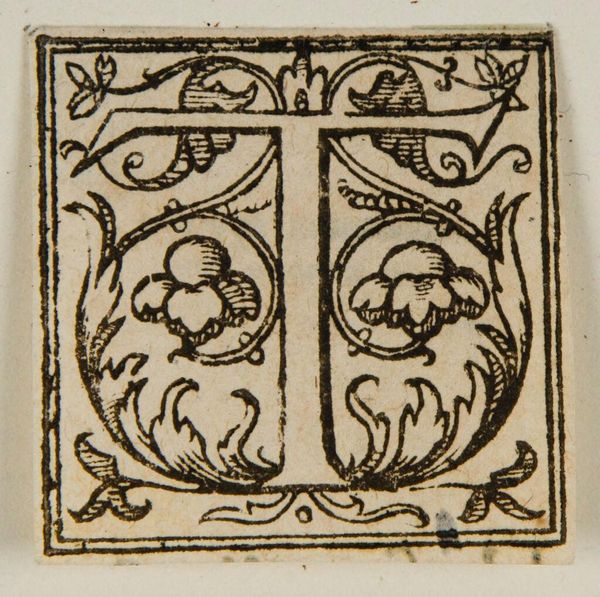
Editor: This piece, titled "Initial T" by an anonymous artist, features a detailed woodcut design. The intricate foliage and creatures give it a lively, almost whimsical feel. What do you see in this piece from a formal perspective? Curator: Note the pronounced interplay between positive and negative space. The bold "T" serves as the structural anchor, while the surrounding organic forms create a dynamic tension. Observe how the artist uses line to define both the letter and the decorative elements, achieving a balance between clarity and complexity. Editor: It's amazing how the artist integrates the letterform so seamlessly into the ornamentation. It feels like the "T" is growing out of the foliage itself. Curator: Precisely. This integration speaks to a sophisticated understanding of design principles, where form and function are not separate entities but rather interwoven elements of a unified whole. Editor: I never thought I could say so much about a single letter! Curator: Indeed. A close look reveals a depth of artistic intention.
Artwork details
- Location
- Harvard Art Museums
- Copyright
- CC0 1.0
Comments
No comments
About this artwork
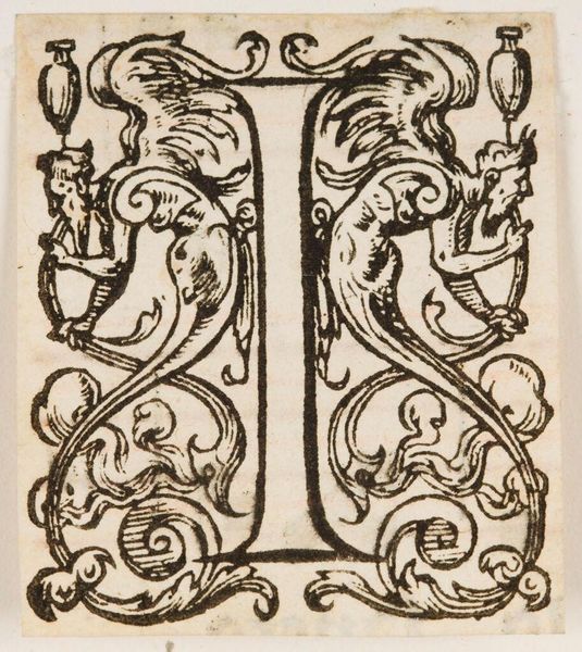
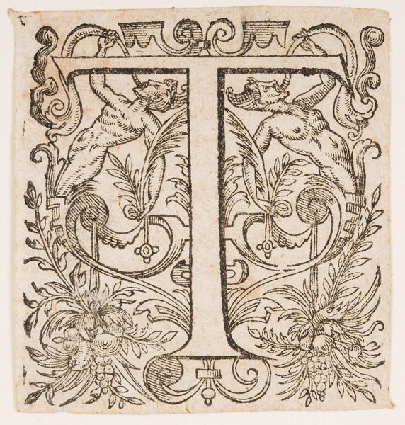
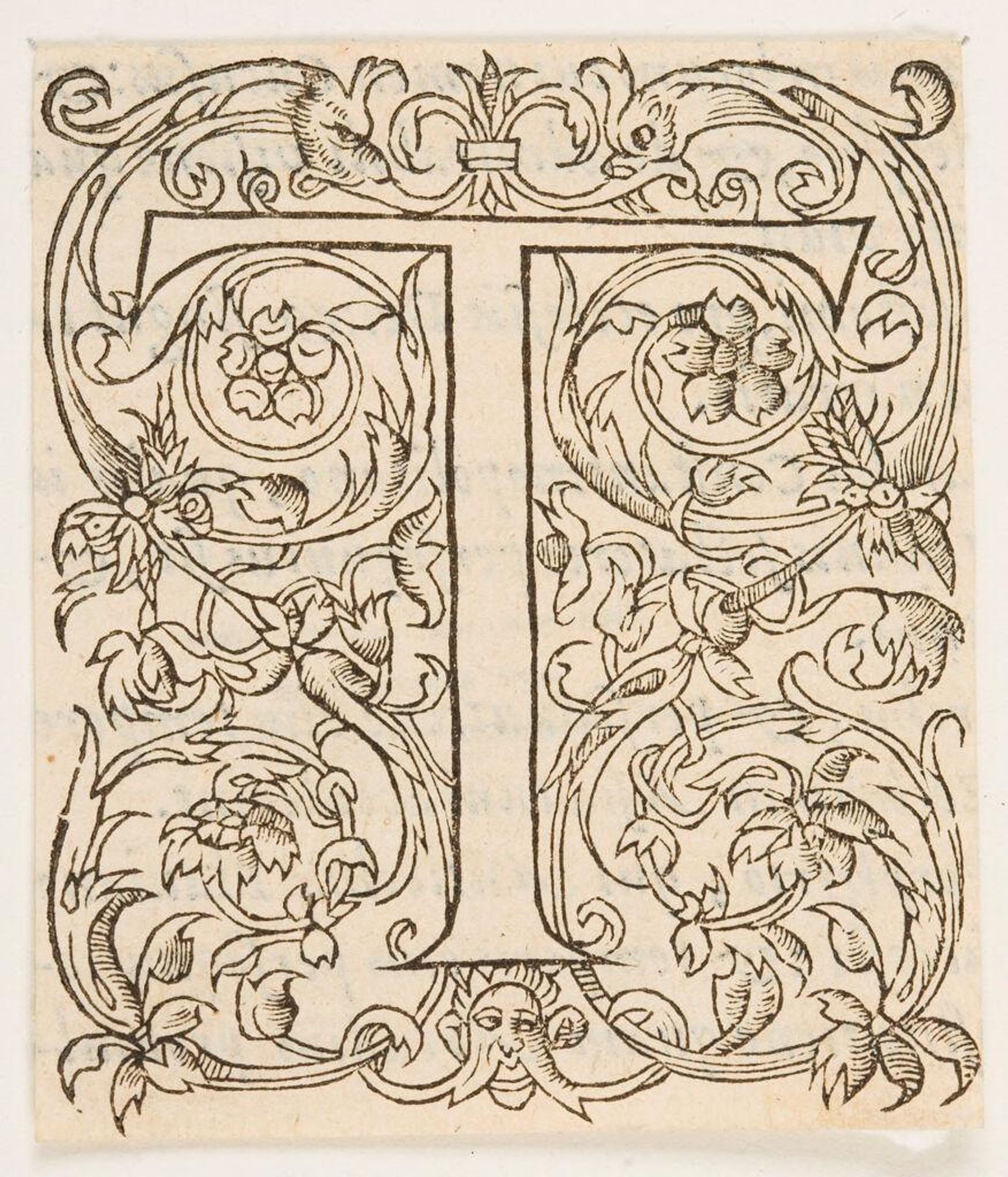
Editor: This piece, titled "Initial T" by an anonymous artist, features a detailed woodcut design. The intricate foliage and creatures give it a lively, almost whimsical feel. What do you see in this piece from a formal perspective? Curator: Note the pronounced interplay between positive and negative space. The bold "T" serves as the structural anchor, while the surrounding organic forms create a dynamic tension. Observe how the artist uses line to define both the letter and the decorative elements, achieving a balance between clarity and complexity. Editor: It's amazing how the artist integrates the letterform so seamlessly into the ornamentation. It feels like the "T" is growing out of the foliage itself. Curator: Precisely. This integration speaks to a sophisticated understanding of design principles, where form and function are not separate entities but rather interwoven elements of a unified whole. Editor: I never thought I could say so much about a single letter! Curator: Indeed. A close look reveals a depth of artistic intention.
Comments
No comments