drawing, paper, ink
#
portrait
#
script typeface
#
drawing
#
aged paper
#
script typography
#
hand-lettering
#
hand drawn type
#
hand lettering
#
paper
#
ink
#
hand-drawn typeface
#
thick font
#
handwritten font
#
golden font
#
calligraphy
Copyright: Rijks Museum: Open Domain
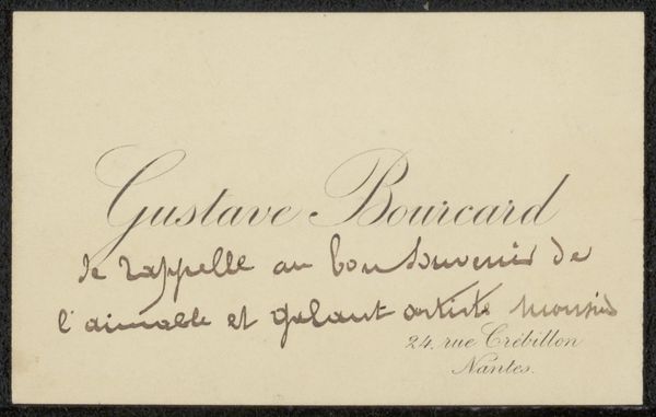
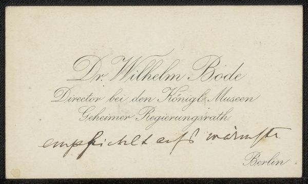
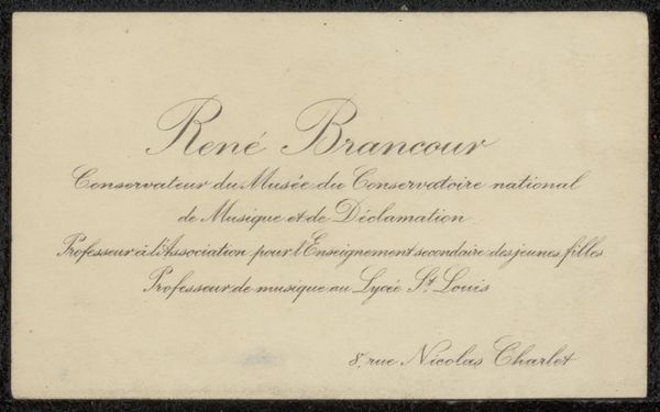
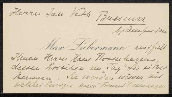
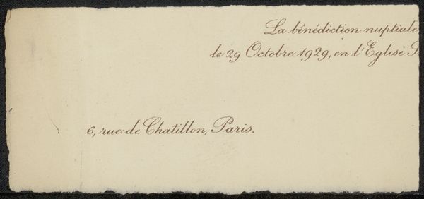
Curator: The work we’re looking at is titled "Visitekaartje aan Philip Zilcken," dating from before 1913. It’s a small ink drawing on paper. What's your first impression? Editor: It feels wonderfully intimate. A whisper across time, sealed in elegant script. The subdued tones lend it an antique, almost fragile quality. The formality, though, stops short of austere due to the calligraphic flourishes. Curator: Exactly. The card's design balances formal announcements, featuring the artist's name in bold capitals: EMILE CHASSINAT, set above more expressive, fluid cursive script denoting his honorific position and warm appreciation to Monsieur Zilcken, ending with a specific address. What cultural signals do you see embedded within this humble thank you note? Editor: It speaks of a cultured class, steeped in tradition and scholarly pursuits. Chassinat’s role as honorary director, and Zilcken's reception of this personal gesture hint at their place in a privileged circle with shared academic interests and, given the carefully rendered handwriting, artistic sensibilities too. Curator: Observe how Chassinat plays with typography—stark, blocky letters paired with flowing calligraphic strokes. This visual dialogue between tradition and personal touch is incredibly nuanced. We see a certain refinement in how text is employed. The card transforms itself into a token that also conveys the relationship between the sender and receiver. Editor: Right! It isn't merely about information conveyance. The selection of fonts, the placement on the page, all emphasize human connection—the gratitude inherent in the gesture. Also, it subtly reinforces the power dynamics of the era by underscoring formality, which in turn indicates the values of respect and appreciation prevalent in well-regarded scholarly society. Curator: True. A deep semiotic investigation reveals that objects deemed "ephemeral" such as this visiting card offers valuable evidence of cultural memory and interpersonal codes that are every bit as revealing as so-called high art! Editor: Definitely. For me, decoding this modest card gives an uncommon window into the layered world of early 20th-century intellectual life. Curator: For me it confirms how skillful integration of type and composition ennobles communication through elevated materiality, offering evidence of aesthetic priorities within the production.
Comments
No comments
Be the first to comment and join the conversation on the ultimate creative platform.
More like this