print, metal
# print
#
metal
#
history-painting
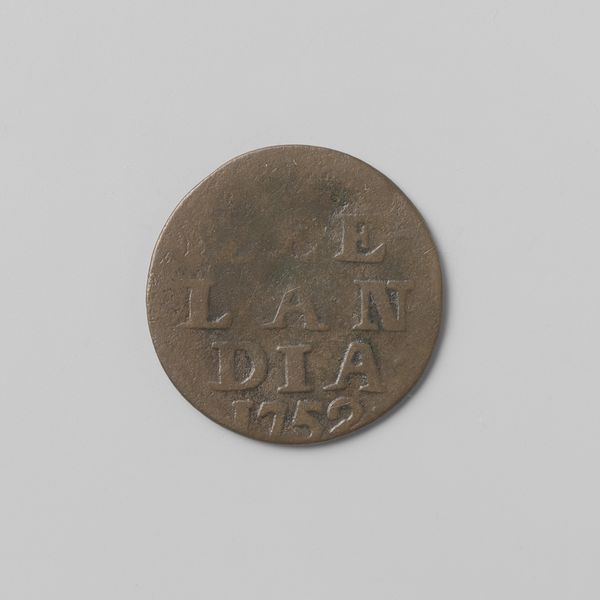
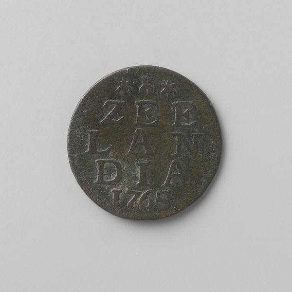
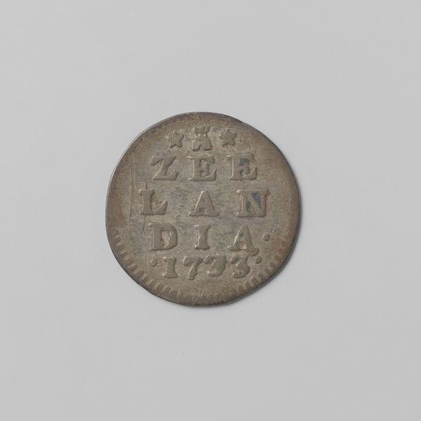
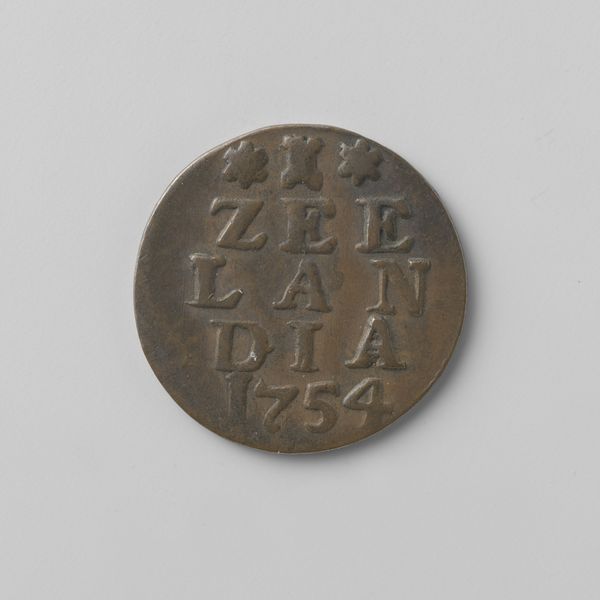
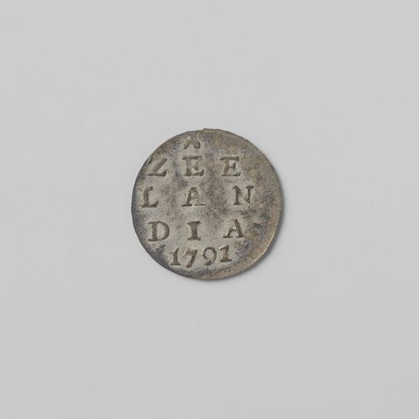
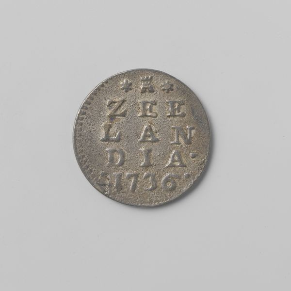
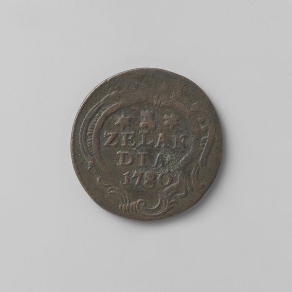
Dimensions: diameter 2.3 cm, weight 2.43 gr
Copyright: Rijks Museum: Open Domain
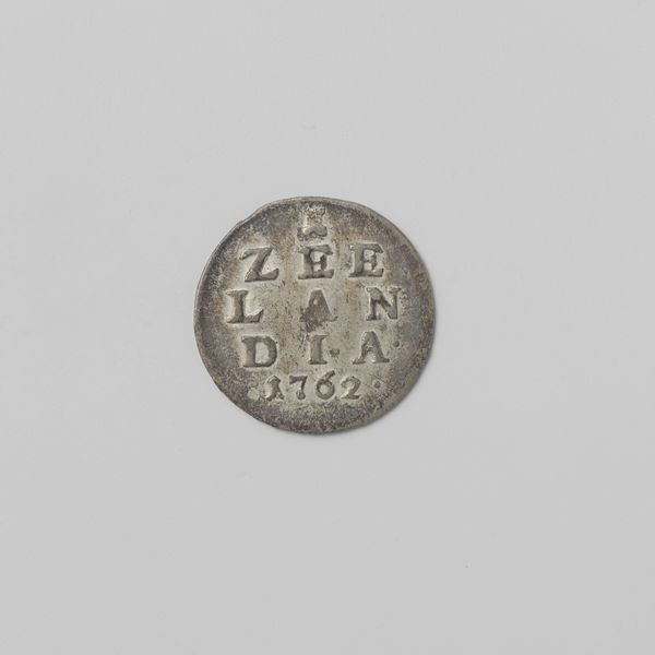
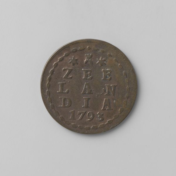
Curator: This is a Zeeuwse duit, minted in 1741, during a tumultuous period in European history. Editor: It feels humble, worn smooth from years of handling. The colour itself is like aged earth, telling a silent story of generations. Curator: The text “Zeelandia,” referencing the Dutch province of Zeeland, dominates the design. Above it are stars and a crown; clear symbols with deep cultural meaning. The stars evoke guidance and destiny, whilst the crown is a visual metaphor of sovereignty. Editor: The layout feels incredibly functional, yet that simplicity, the almost brutal legibility, is what makes it interesting from a design perspective. Each letter seems grounded, solid, like it was hewn straight into the metal. Curator: Indeed. The choice of the typography carries symbolic weight, signaling power, and reinforcing identity. This coin speaks of Zeeland’s cultural and economic resilience through its recognizable emblem. Editor: The subtle patinas in the metal add layers to this concept. Each dark crevice speaks to weathering. Curator: Absolutely. What resonates is its durability—these physical embodiments were touched and passed down through time, reminding people of their shared heritage. Editor: It’s captivating how something so minimal could evoke such strong reactions about the values, concerns, and cultural memory embedded in what seems like just currency. Curator: By encoding these beliefs, these visual devices became mnemonic, which allowed the population to continually affirm their collective story every time they used these duit. Editor: It’s fascinating how examining a single object can unfold histories.
Comments
No comments
Be the first to comment and join the conversation on the ultimate creative platform.
More like this