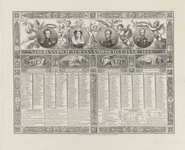
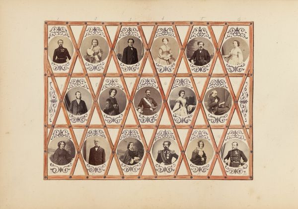
French Calendar for the Year 1816 (Galerie Generale des Souverains des Etats Européens) 1816
0:00
0:00
drawing, print, paper, engraving
#
portrait
#
drawing
#
neoclacissism
# print
#
paper
#
genre-painting
#
history-painting
#
engraving
Dimensions: Sheet: 12 in. × 12 1/2 in. (30.5 × 31.8 cm)
Copyright: Public Domain
Curator: I find the red and gold decoration quite opulent and rather imposing for something as commonplace as a calendar. Editor: Precisely! What we're looking at is a "French Calendar for the Year 1816," and it's part of a larger collection known as the "Galerie Generale des Souverains des Etats Europeens," which translates to something like "General Gallery of the Sovereigns of the European States." The calendar itself is an engraving, done on paper. Curator: The verticality created by the columns seems to lend this piece a strange classical weight that juxtaposes strangely with the banality of marking dates, appointments, and sundry daily activities. Editor: Yes, and it certainly served a dual purpose, functioning as a decorative display of power. Take a closer look at the portraits depicted along the top. This isn't just about marking time, it's about positioning France, after the Napoleonic era, within a broader context of European sovereignty. Note that it's designed around a Neoclassical framework which was popular at the time. Curator: So you think it represents a strategic alignment to an ideological framework to ensure and guarantee France’s return to the accepted fold of the European powers? The printing gives a strange tonal palette… Editor: Absolutely. The visual language reinforces that idea of re-integration and perhaps signals a desired return to order. Look at the clean lines of the neoclassical architecture used to frame each portrait. The paper itself almost seems aged deliberately; consider the date – less than a decade after the revolution – where old regimes literally printed new images and fables over older and equally subversive imagery. It underscores an attempt to cement the Bourbon Restoration in the visual culture. The choice of portraiture lends itself to this historical revisionism. Curator: That's a fascinating interpretation. From a more technical perspective, the balance feels… slightly off. Perhaps it is the material support but I feel the composition might be straining from an excess of ornament and symbol that distracts from the subject’s own virtues and simplicity. The design perhaps suffers from the excess, wouldn’t you say? Editor: I can see your point. The density could be interpreted as a way to crowd-out any dissenting voices or subversive messaging – essentially flooding the scene to ensure one unified front. This kind of controlled maximalism visually speaks of controlled messaging that reinforces an era where political symbolism and presentation went hand-in-hand. Curator: A fascinating period and, despite some possible reservations about composition, certainly a compelling example of both the era’s anxieties and ambitions in the realm of socio-politics. Editor: Agreed. And seeing these through the lens of formal and historical analysis reveals hidden narratives within the simple function of keeping time.
Comments
No comments
Be the first to comment and join the conversation on the ultimate creative platform.
More like this