drawing, watercolor, poster
drawing
landscape
house
figuration
watercolor
russian-avant-garde
watercolour illustration
genre-painting
poster
building
Copyright: Public domain
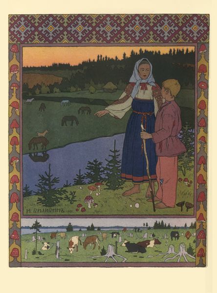
Ivan Bilibin made this image, called 'At the well', at an unknown date, using what looks like ink and gouache. The piece feels decorative, like an illustration from a book, with clear flat colours and a decisive outline that makes everything look crisp. I like how the well is constructed using straight, angular lines and a restricted palette. The buildings behind her are also very angular. This creates a dialogue with the organic shapes of the trees, the girl’s scarf and the sunflower motifs, which are more sinuous and flowing. The composition is split in a strange way, with the top half of the picture showing a village scene, and the bottom half showing the girl in the foreground at the well, as if they are in two different spaces. I always wonder, is this a mistake, or an innovation? There's a naive quality to this work. Maybe Bilibin was influenced by folk art, or maybe we can see him in dialogue with artists like Gustav Klimt, who also worked with flat colour and decorative borders. In the end though, this piece remains open, and it’s up to us to decide how we read it.
Comments
No comments
Be the first to comment and join the conversation on the ultimate creative platform.
More like this