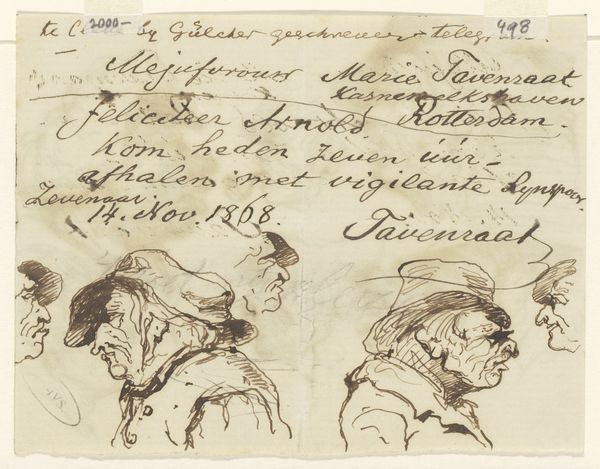
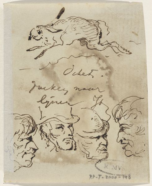
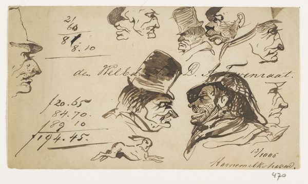
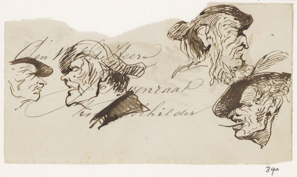
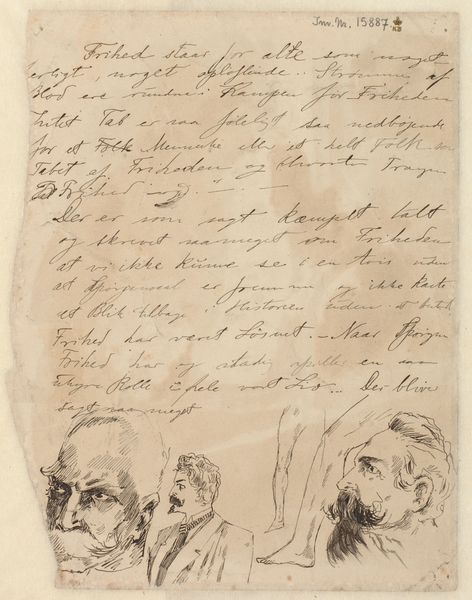
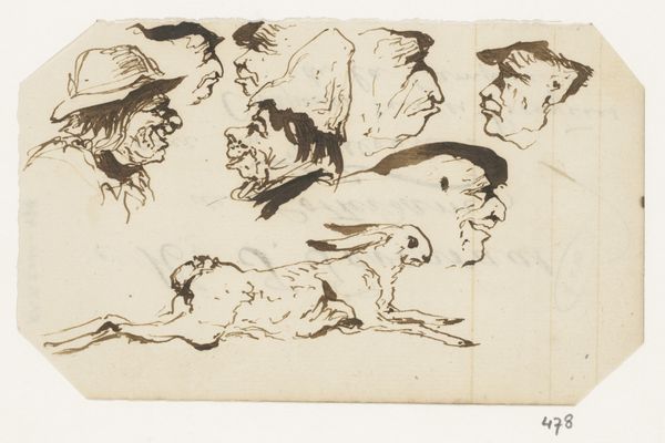
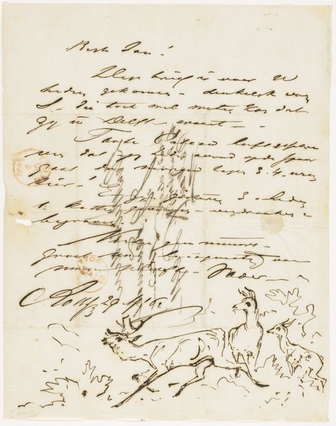
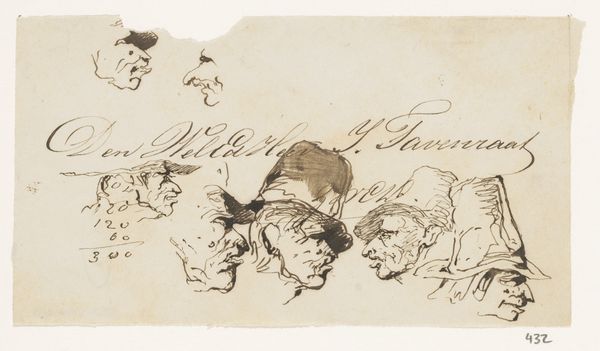
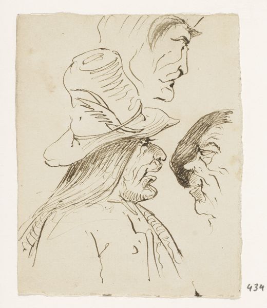
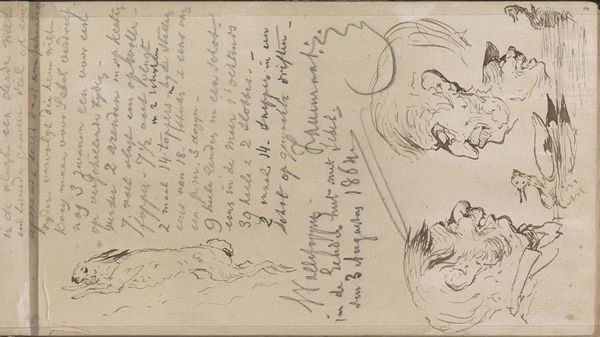
drawing, ink, pencil
#
portrait
#
drawing
#
ink drawing
#
animal
#
pencil sketch
#
figuration
#
ink
#
pencil
#
horse
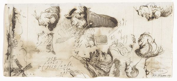
Dimensions: height 223 mm, width 142 mm
Copyright: Rijks Museum: Open Domain
Editor: This is "Brief met schetsen van koppen, honden en paard," or "Letter with sketches of heads, dogs, and horse," by Johannes Tavenraat, created sometime between 1860 and 1866. It’s a drawing using ink and pencil, and it looks almost like a study sheet. What elements of the visual composition strike you most? Curator: The composition immediately suggests a hierarchy established through line and form. Observe how the artist uses a range of line weights to define the contours and interior details of the subjects. Note the juxtaposition of text and image, disrupting conventional artistic space. Do you perceive a deliberate interplay between these graphic elements? Editor: I do see it. The letter almost seems to interact with the images; they're not completely separate. Is the artist trying to say something by mixing them? Curator: Precisely. The integration suggests an exploration of textual and visual modes of representation. Consider the surface texture achieved through the layering of pencil and ink. These textural nuances affect how we perceive the sketches, almost as though they are not simply representational but have a life of their own. Are the formal elements reinforcing certain readings, would you say? Editor: Maybe that they're all connected; that art and life, writing and image-making, are just different ways of thinking? It's looser and more expressive than I first thought. Curator: Indeed. By examining the structural interplay between line, form, and texture, we've accessed new interpretations of Tavenraat's artistic methodology. Editor: It’s interesting how close formal analysis revealed the complex relationship between the sketches and text on the page. Curator: A focused study of composition reveals innovative practices from an earlier time.
Comments
No comments
Be the first to comment and join the conversation on the ultimate creative platform.
More like this