graphic-art, print
#
script typeface
#
graphic-art
#
script typography
# print
#
book
#
hand drawn type
#
hand-drawn typeface
#
thick font
#
white font
#
handwritten font
#
delicate typography
#
decorative-art
#
thin font
#
small font
Dimensions: height 169 mm, width 122 mm
Copyright: Rijks Museum: Open Domain
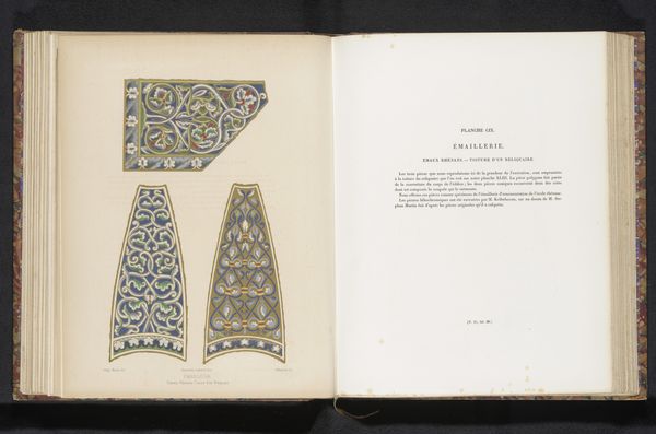
Curator: Here we have an intriguing image – it's a depiction of a book cover dating back to before 1881, titled "Omslag van een boek met teksten van Romeinse dichters", or "Cover of a book with texts by Roman poets" in English. It is an example of graphic art using print techniques. Editor: My first thought? Elegant and a little restrained. The repetitive patterns on the cover create a surprisingly grounded effect. It feels more like crafted material than high art, which somehow gives it a really human touch. Curator: Absolutely. The creation process of such a book cover speaks volumes about the means of production at the time. This wasn't just about aesthetic design; it was about bookbinding, printing techniques, and probably the economics of accessible literature during the late 19th century. I wonder about the scale of its production—was this mass produced or something exclusive? Editor: Exactly. Look at that lettering. So delicate! You almost imagine the artisan sketching it out by hand before it was ever replicated. I bet it smelled wonderful—that rich leather smell combined with the paper and inks. The craftsmanship really speaks to me. I feel like I could curl up with it right now. Curator: We can see it through today's lens and recognize its worth beyond merely containing classical texts. Consider the societal value invested in making literature accessible; even the "decorative arts" aspect becomes part of a wider movement toward public knowledge and perhaps challenges perceptions of value between function and aesthetics. Editor: And it's those subtle acts, that blurring of high and low art, that make these objects breathe with a soul, isn't it? You have to wonder, did whoever chose that binding design have any inkling it would spark conversations about labour, and social dynamics over a century later? Maybe somewhere deep down, they did. Curator: Perhaps they did, maybe it’s wishful thinking on my part, but it does make you think. Editor: Definitely food for thought.
Comments
No comments
Be the first to comment and join the conversation on the ultimate creative platform.
More like this