painting
#
portrait
#
painting
#
war
#
landscape
#
figuration
#
cartoon
#
geometric
#
soldier
#
horse
#
men
#
russian-avant-garde
#
cartoon style
Copyright: Public domain
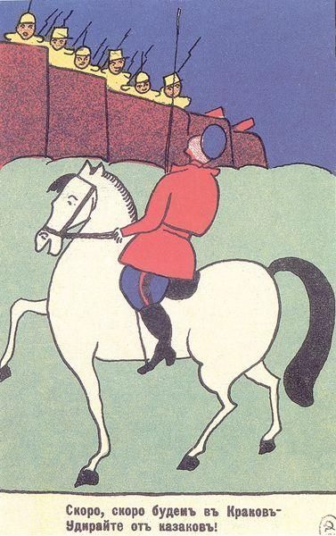
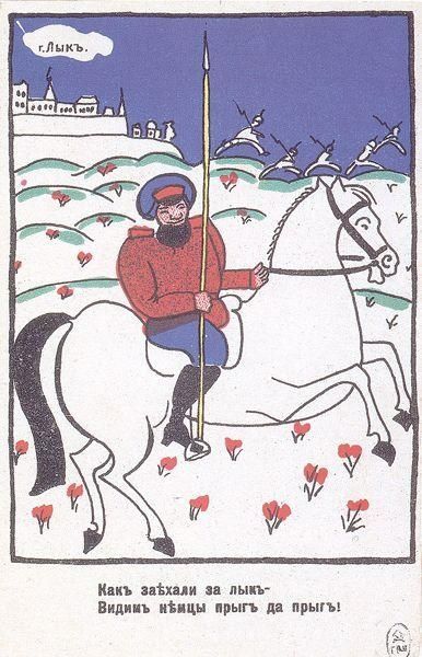
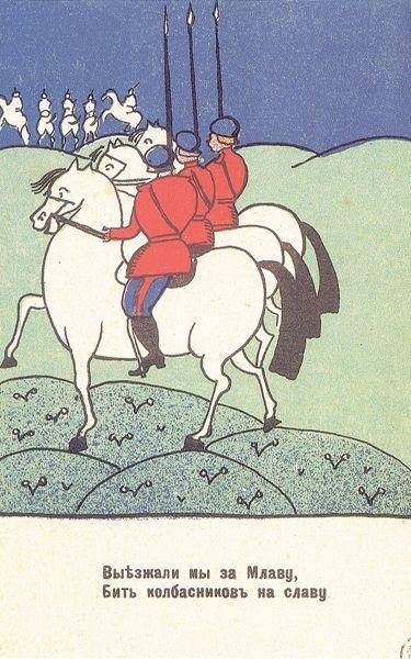
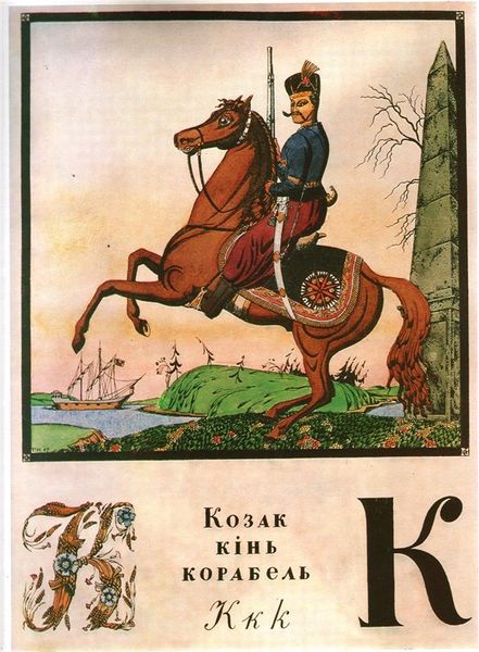
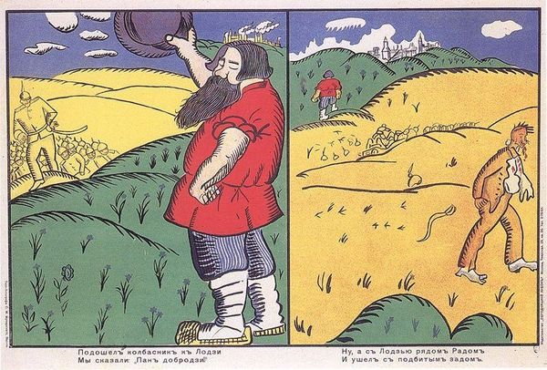
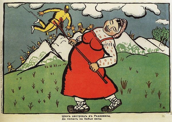
Curator: Immediately striking, isn't it? The vibrant colors belie what I imagine to be a harrowing subject. Editor: Indeed. We're looking at "We went from the Kovno", a painting from 1914 by Kazimir Malevich, placing it squarely within the early years of World War I. What’s interesting here is how he utilizes a cartoon-like aesthetic, which feels quite unsettling when paired with the theme of war. Curator: The simplification of form is rather striking, isn't it? Consider the almost childlike depiction of the landscape. The rounded hills and repetitive heart-like shapes suggest an ordered space, while the rendering of the architecture suggests it could be teetering or exploding. Editor: Absolutely, and consider how the cultural context may be playing a role in the use of certain signs and symbols within Malevich's artistic approach during this time. World War I propaganda often simplified narratives. Is Malevich's decision here a nod towards or commentary on the broader cultural landscape during that period? How does the style influence our reception and interpretation of this piece and the real experience it depicts? Curator: The tension arises from this supposed visual levity contrasted with the realities of war being fought. Is this a deliberate subversive act intended as social commentary by Malevich? The flat picture plane feels reminiscent of posters, perhaps meant for mass distribution to galvanize a specific societal response? Editor: The lack of perspective and flattening are interesting. The simplification of forms emphasizes the material qualities, creating symbolic associations rather than replicating reality. It also helps render the narrative easily decodable by viewers removed from academic contexts. What do you see in the choice of colors used here, though? Curator: The stark contrasts contribute to that almost harsh quality you mentioned initially; notice how they complement each other tonally and support one another through placement in the picture plane. Editor: Food for thought indeed! This piece serves as a reminder that a painting from 1914 can hold up to an exploration through history and form. Curator: Leaving us with yet another way to view art—with both our eyes and minds.
Comments
No comments
Be the first to comment and join the conversation on the ultimate creative platform.
More like this