#
word art style
#
pattern out of typography
#
hand-lettering
#
hand drawn type
#
hand lettering
#
word art
#
eye-catchy type
#
line
#
pattern repetition
#
imprinted textile
#
funky pattern
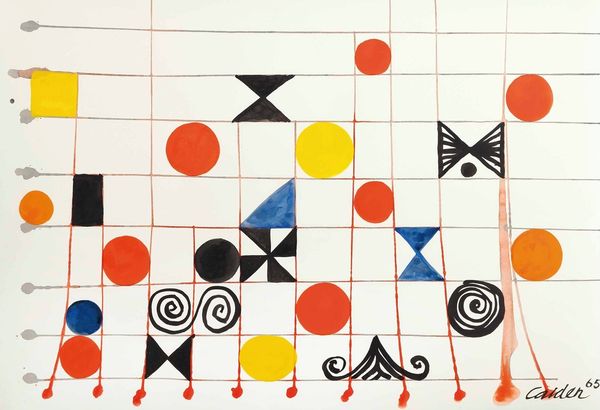
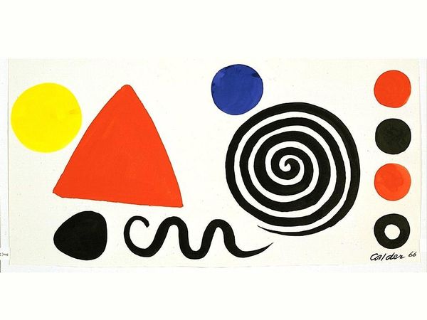
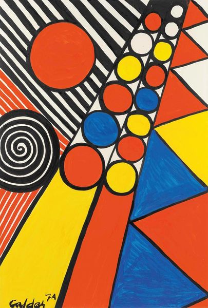
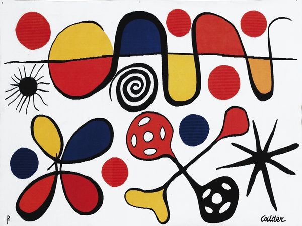
Copyright: Alexander Calder,Fair Use
Curator: Standing before us is Alexander Calder's "Grid With Symbols" from 1966, a captivating work on paper. Editor: My immediate reaction is playful chaos! The primary colors pop, yet the hand-drawn grid imposes an interesting, almost architectural structure. It is reminiscent of building blocks. Curator: It's intriguing to consider how Calder, primarily known for his sculptures, explored the grid in two dimensions. This wasn't merely sketching, it feels like a deliberate investigation of form and space through the simplified elements of geometric abstraction. I imagine the physical act of laying down each grid line and symbol would have been quite tactile, almost like weaving or assembling one of his mobiles. Editor: Absolutely. Looking closer, the seemingly simple symbols possess such distinct personalities, don't they? They bring to mind pre-industrial sign-making practices, evoking a certain accessible folksiness but within this modernist framework. And that rigid grid subverts its own utility; some lines are more defined than others. This suggests Calder embraced imperfection. Were such symbolic and rudimentary forms typical of artworks during this period? Curator: The beauty is in his deviation from the austere formalism associated with some mid-century abstract art. While there was certainly a turn to more direct and simplified processes, his focus remained firmly rooted in making rather than an intellectual rejection of earlier forms of production. One should consider what this seemingly simple act of arranging symbols reflects about societal structures. Were we more or less free at this moment? What messages did a composition of elementary blocks transmit? What kind of access does it give to certain ideas? Editor: That makes sense, it suggests an exploration of universal symbols, transcending cultural boundaries, in a moment in time when political statements might have otherwise been censored. He creates this common ground, perhaps commenting on our shared human experience, but within these self-imposed boundaries. The deliberate "off-ness" lends it vulnerability, allowing for viewers to have intimate responses to it. Curator: Indeed, his emphasis on the materiality and arrangement pushes us to rethink the potential for a shared visual language stripped of rhetoric. Editor: Overall, there’s a feeling of organized rebellion that remains surprisingly fresh decades later, wouldn’t you say? Curator: Very true, a simple structure and symbolism reveal deeper dimensions than they let on.
Comments
No comments
Be the first to comment and join the conversation on the ultimate creative platform.
More like this