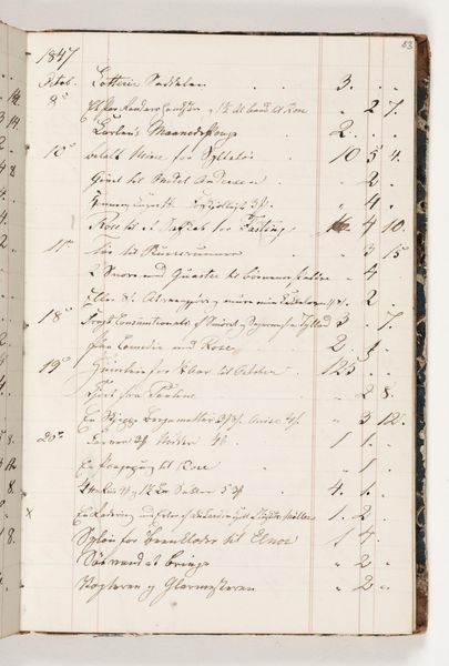
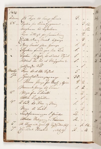
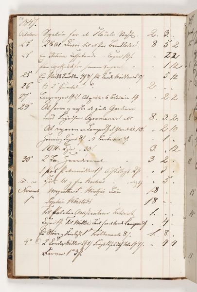
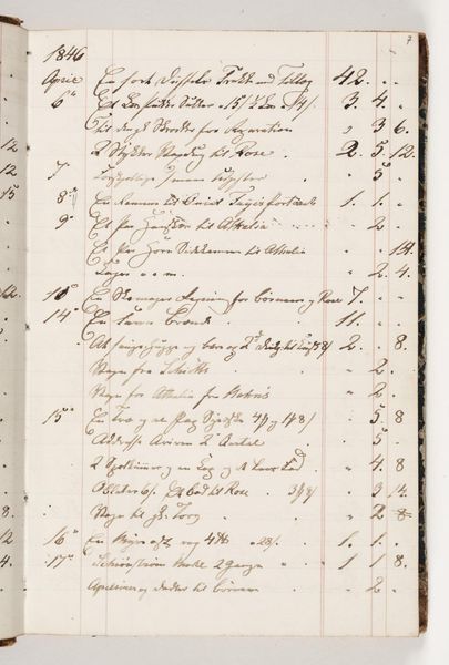
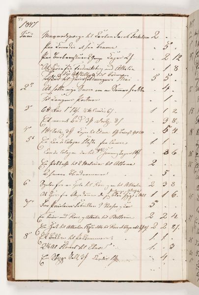
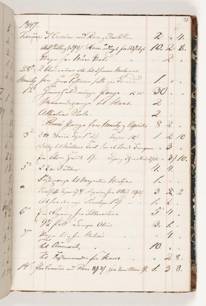
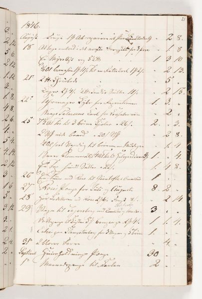
drawing, paper, ink
#
drawing
#
medieval
#
paper
#
ink
#
watercolor
Dimensions: 200 mm (height) x 130 mm (width) (bladmaal)
Editor: Here we have *Regnskab 1847*, a drawing made with ink and watercolor on paper by Martinus Rørbye. It's essentially a page of handwritten accounts. The dense script and structured layout give it a surprisingly graphic quality, like an abstract composition despite being functional. What do you see in this piece, looking at it formally? Curator: Initially, I'm drawn to the rhythmic nature of the script. Notice how the ascenders and descenders of the letters create a calligraphic landscape, a fluctuating horizon line across the page. Observe how the rigid numerical entries down the right contrast with the free flow of the handwritten descriptions on the left, dividing the space but connecting through linear rhythm. The contrast directs the viewer's eye to analyze the relationships. Editor: I see that. It's not just a document; the hand is what brings visual balance and energy to it. Curator: Precisely. Moreover, examine the quality of the lines. The variation in pressure and thickness of the ink suggests a human presence, the deliberate act of writing. Is this intentional? Do these fluctuations carry some form of semantic coding? The tight line spacing crowds the drawing plane while contributing to a holistic texture of graphic language. Editor: The materiality gives texture to the visual balance and organization. Is it an efficient mode for transferring information? Probably, yes. Is it visually stimulating and elegant? Emphatically, yes. Curator: And that stimulation resides, primarily, in the structural organization and graphic variations achieved with simple medium and minimal composition, as a functional drawing.
Comments
No comments
Be the first to comment and join the conversation on the ultimate creative platform.
More like this