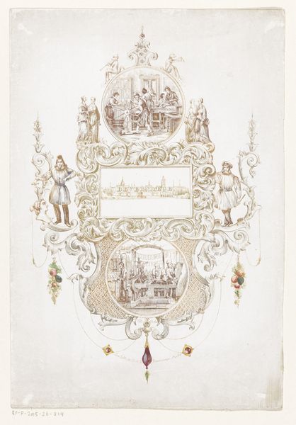
Ontwerp voor kamerversiering met een paneel met een staande krijger 1767 - 1823
0:00
0:00
drawing, watercolor, ink
#
drawing
#
neoclacissism
#
blue ink drawing
#
figuration
#
watercolor
#
ink
#
watercolour illustration
#
history-painting
#
decorative-art
Dimensions: height 392 mm, width 272 mm
Copyright: Rijks Museum: Open Domain
Curator: My first impression? The colors seem almost like a faded memory, yet the warrior stands proud. There's a quiet defiance there, almost melancholy. Editor: We are looking at "Ontwerp voor kamerversiering met een paneel met een staande krijger," a design for room decoration with a panel featuring a standing warrior. Abraham Meertens created this drawing between 1767 and 1823 using ink and watercolor. You mentioned a sense of faded memory; do you feel that relates to its function as decor? Curator: Precisely! Imagine this in a grand room, a subtle whisper of heroism and ancient glory mingling with the daily life of its inhabitants. The almost ghostly watercolor lends itself to reverie. But how do the materials themselves, the paper, the ink, inform its creation as a “design”? Editor: The choice of ink and watercolor speaks to a couple of things. Watercolors offered the opportunity for mass production and control; there was a degree of artistry involved in pigment creation. Ink and watercolor are interesting because, while common materials, they don't signal wealth like gold or imported lapis lazuli might have. Meertens emphasizes precision in a world turning towards the mechanized image. It underscores labor! Curator: "Labor," yes. But perhaps also, there's a dream of precision, a yearning to capture the ideal form, perfectly rendered. The flowers surrounding the panel are not exactly lifelike in their rendering. I wonder what he wants to convey: history versus whimsy, seriousness versus frivolity? Is this an aspirational scene for those who will be inhabiting the space, an echo of bravery and morality? Or merely just a surface image for a growing merchant class who had the ability to decorate in such a way? Editor: What makes this drawing significant is how it challenges such high/low distinctions. Look at those trailing floral embellishments combined with a martial, dominant subject: you've hit on the commercial tensions perfectly. The very premise involves "decor," itself something deemed of the home. This artwork invites viewers to explore interior lives in interior spaces! Curator: And what do these materials enable him to express that perhaps a more obviously costly one couldn't? Maybe humility and quiet reflection... perhaps even a subversive wink within those perfectly drawn lines. Editor: Precisely! It reframes traditional heroism with new artistic materials—cheap but enduring. Curator: Well, this design is certainly a rich meditation, one I'll continue pondering on my way out! Editor: Agreed. The materials and its creator encourage us to examine how heroism and home decor blur!
Comments
No comments
Be the first to comment and join the conversation on the ultimate creative platform.
More like this