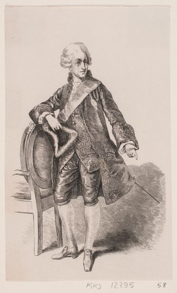
drawing, ink, pen
#
portrait
#
drawing
#
ink
#
pen
#
portrait drawing
#
genre-painting
Dimensions: height 380 mm, width 311 mm
Copyright: Rijks Museum: Open Domain
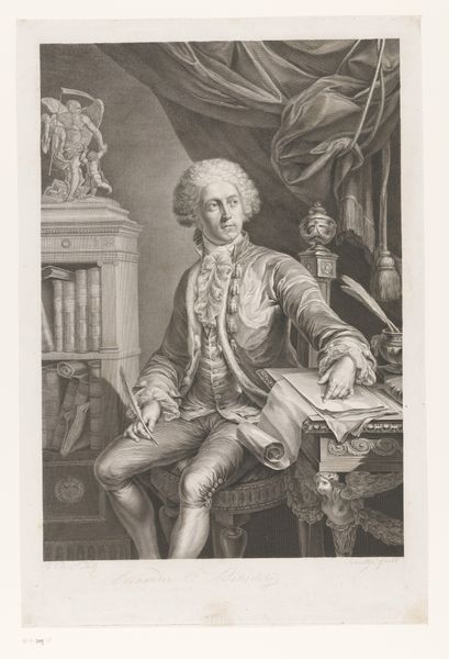
Editor: Here we have an ink and pen drawing, "Portret van de schilder Jan ten Compe," made sometime between 1734 and 1851. It's quite a confident self-presentation, and I'm struck by the contrast between the delicate details of the lace and the overall sketchiness. What do you make of the composition, with the artist surrounded by the tools and settings of his trade? Curator: The immediate aspect that arrests attention is the tension arising from the artist's pose and placement in relation to the pictorial plane. Observe the confident contrapposto juxtaposed against the almost flattened space. Note how the light, rather than revealing form, flattens it. Editor: So you're focusing on how the artist has handled form within the flat plane? Curator: Precisely. Consider the linear quality, evident not just in the outlines but also in the rendering of details. The question arises: how does this linearity contribute to the overall structure? How does it emphasize certain forms over others? What philosophical positions may support these artistic decisions? Editor: The emphasis on line makes it feel very deliberate, even though the textures feel very different within the forms, if that makes sense. Almost like two styles combined, deliberately contrasting the delicacy and flatness. Curator: Indeed. That controlled contrast between texture and linearity underscores the calculated artifice. Is this artificiality deployed for pure aesthetic pleasure, or is there a latent meaning imbued through the arrangement? It compels a detailed inspection of its elements, prompting inquiry into its symbolic structure and underlying intention. Editor: This has certainly given me a new way to think about portraiture. I was initially focused on the subject, but now I can appreciate the way the techniques and contrasting styles create depth and invite interpretation. Curator: The visual construction shapes our understanding. And recognizing this can refine one's comprehension of not only art, but the nature of experience itself.
Comments
No comments
Be the first to comment and join the conversation on the ultimate creative platform.
More like this