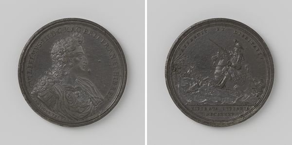
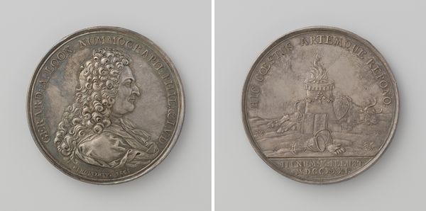
print, metal, bronze
#
portrait
#
medal
#
baroque
# print
#
metal
#
bronze
Dimensions: diameter 2.6 cm, weight 7.47 gr
Copyright: Rijks Museum: Open Domain
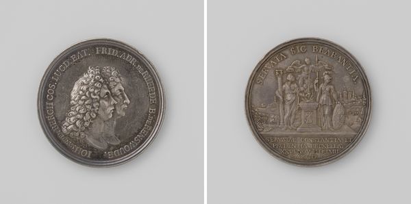
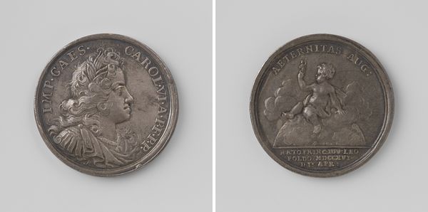
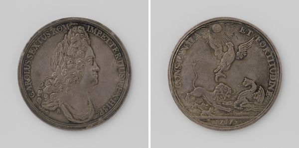
Editor: Here we have "Peace of Rastatt", a bronze medal crafted in 1714 by Georg Wilhelm Vestner. The first thing that strikes me is how precisely detailed the portraits and text are on such a small object. What artistic choices stand out to you? Curator: The bilateral symmetry is immediately apparent, with the portrait of Charles VI mirrored, conceptually if not literally, by the cherubic figure on the reverse. This mirroring introduces a sense of balance, but also of contrasting power dynamics: earthly versus divine. How does the inscription play into this composition, in your estimation? Editor: Well, it frames the portraits quite literally, almost like a border, adding to the sense of order. But it’s also...descriptive. "Peace of Rastatt" gives the whole work a purpose. Curator: Indeed, but note *how* it frames. The tight, almost claustrophobic lettering surrounding the emperor versus the more open, flowing script accompanying the cherub – does this contrast offer another layer of interpretation, perhaps regarding the burdens of leadership versus the freedom of peace? And how might the baroque style influence this interplay? Editor: It's interesting, the lettering and curly wig definitely confine Charles. Whereas the cherub is all flowing lines and space. The Baroque influence emphasizes grandeur in the portrait but levity in the cherub image. This contrast suggests a visual narrative about the shift from war to peace. I've never looked at art from this angle before, thinking about the layout of text as a design choice and how it contributes to meaning! Curator: Precisely. Close visual analysis allows us to unravel even seemingly simple compositions to reveal a layered complexity. The smallest details are always telling.
Comments
No comments
Be the first to comment and join the conversation on the ultimate creative platform.
More like this