Copyright: Modern Artists: Artvee
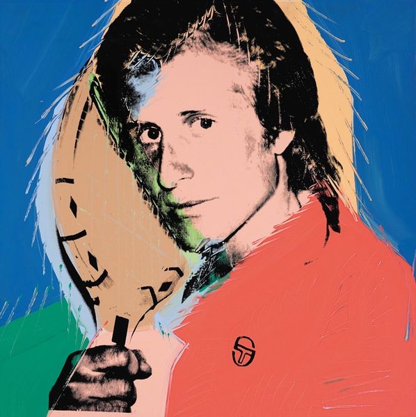
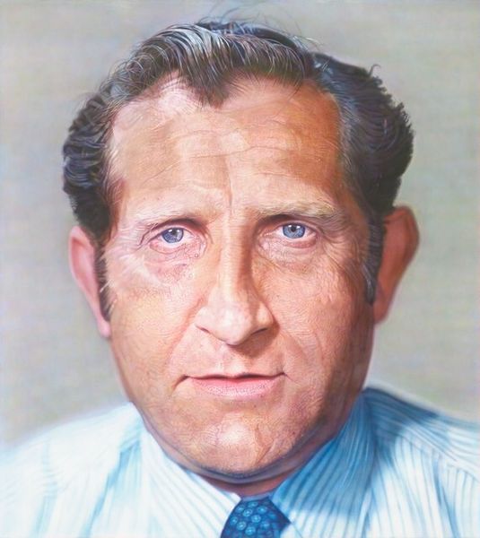
Curator: Here we have Andy Warhol’s striking portrait of Richard Weisman, created in 1985 using acrylic paint. The bright colors and simplified forms are immediately captivating. Editor: Absolutely! There's something almost unsettling about those vivid colors and flat planes. The icy blue background combined with the unnaturally bright red tie makes the subject seem...removed from reality, almost like an idealized figure or character, as you might see on magazine covers. Curator: The flatness is key; it aligns perfectly with Warhol's fascination with surface and image. Look at how he reduces Weisman's features to basic shapes and solid blocks of color. The black outline of the hair creates a graphic punch and serves to flatten and unify, not individuate or naturalize. Editor: Indeed. The choice of that particular shade of red is very specific, the suit reads differently, almost faded in comparison with the sharp tone of the red. It’s charged. Considering red's longstanding association with power, passion, and even danger, especially within portraits, it presents Weisman in a specific light. Curator: And think of how Warhol often replicated portraits, silkscreening them in a variety of colors. Here, it seems, it isn't about serial repetition. We are focusing on a specific image, not one amongst many. Editor: Still, the overall aesthetic is one of artificiality and cool detachment, in Warhol's very distinctive style. What is curious to me is that the background almost looks like a washed-out, brighter cyan which creates an uninviting contrast when paired with his peach-colored face. Almost ghostly... Curator: The color selection does seem very deliberate and not traditionally complimentary. There are sharp boundaries of color between the sections of the suit, skin and the background—a sharp but consistent visual logic. This creates an emotional distance in an almost purely formal construct. It distances itself from the need to capture depth through color. Editor: It leaves one to ponder, how Warhol selected Weisman. Does his style clash here? And I am intrigued how the selection of cyan speaks of an aloofness, with little connection to life in that shade. Very striking indeed! Curator: I agree! Exploring the flat image against the iconic associations certainly provides ample ground for future discussions.
Comments
No comments
Be the first to comment and join the conversation on the ultimate creative platform.
More like this