drawing, graphite
#
drawing
#
cubism
#
quirky sketch
#
pen sketch
#
sketch book
#
abstract
#
personal sketchbook
#
idea generation sketch
#
sketchwork
#
pen-ink sketch
#
expressionism
#
abstraction
#
line
#
graphite
#
sketchbook drawing
#
sketchbook art
#
modernism
#
initial sketch
Copyright: Public Domain: Artvee
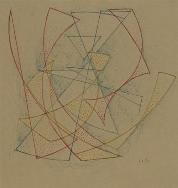
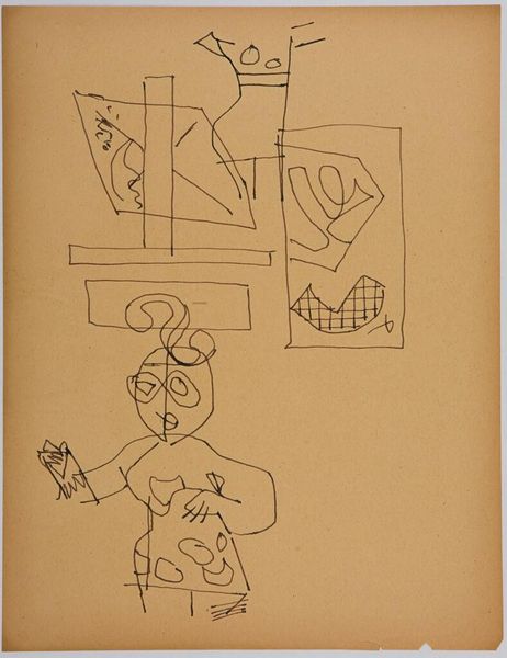
Paul Klee made "Drei in Verworrenheit" using line and color to create a sense of playful complexity. It’s all about how he puts the marks down, isn’t it? The texture is simple, just pencil and a little color on paper, but the feeling is rich. Look at how those geometric shapes tangle up to make figures. The lines are confident, but the overall effect is light and kind of funny, right? I mean, what’s going on with that top head? It’s like a Mondrian gone delightfully wrong. That one red mouth on the left, almost hidden, is the key. It pulls the whole thing together, suggesting expression amid the chaos. Klee’s like a visual poet, finding beauty in simple means. You could stick this next to a Miro and see the same whimsical spirit, a kind of visual jazz. It's not about perfection, but about seeing what happens when you let your imagination run wild.
Comments
No comments
Be the first to comment and join the conversation on the ultimate creative platform.
More like this