Copyright: Modern Artists: Artvee
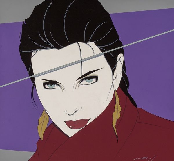
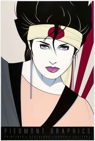
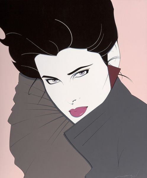
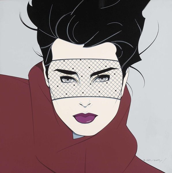
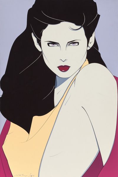
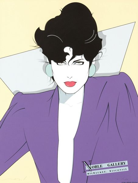
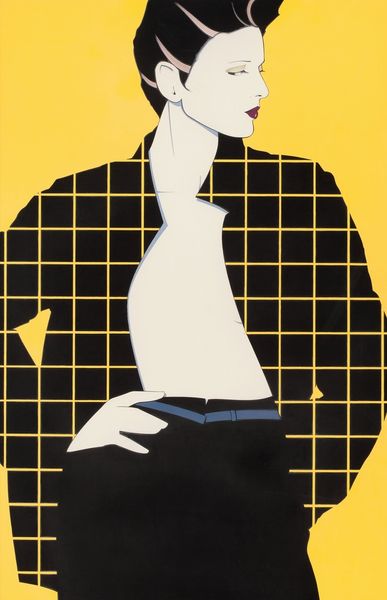
This Galérie Michael Serigraph was made by Patrick Nagel, but the date is unknown. It's so interesting how Nagel breaks down the human form into these clean, almost architectural shapes. It’s like he’s building a face rather than painting one, and the process becomes so visible. Look at the stark contrast between the black hair and the pale skin; it’s so bold. The flatness of the colours, the lack of blending, it all feels very deliberate. It's tempting to describe the effect as cold, but the subtle blush of her lips and the sharp glint in her eyes give the image a certain energy. There's a kind of playful confidence there. Nagel reminds me a bit of Alex Katz in his simplicity, but with a harder, more graphic edge. It’s a reminder that art doesn't always have to be about complexity; sometimes, it’s about how much you can say with the bare minimum.
Comments
No comments
Be the first to comment and join the conversation on the ultimate creative platform.
More like this