Copyright: Modern Artists: Artvee
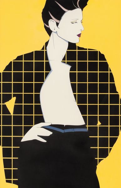
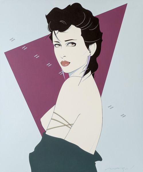
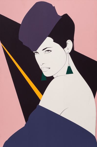
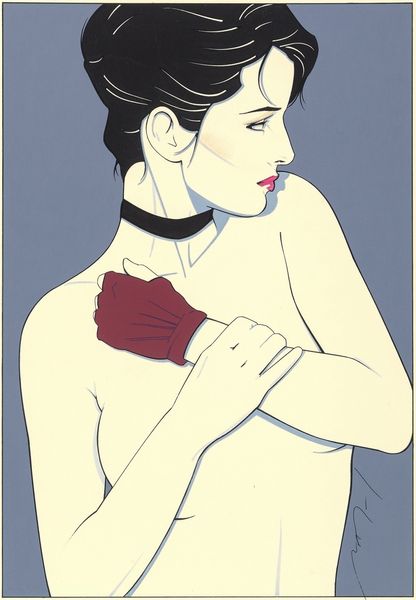
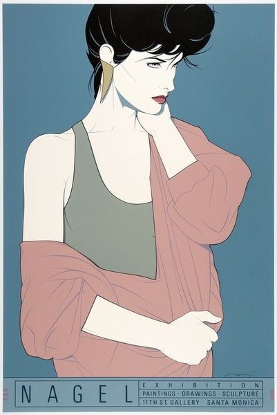
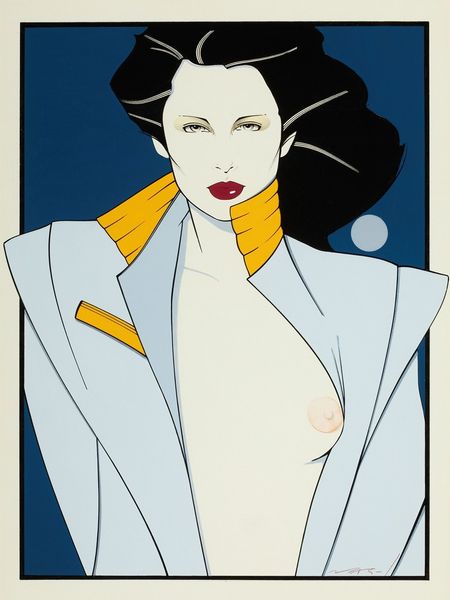
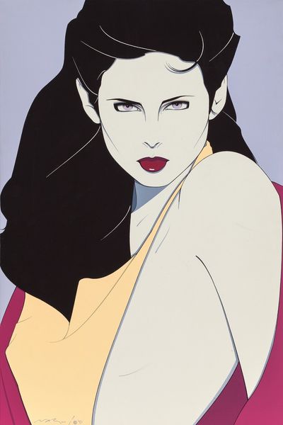
Editor: Here we have Patrick Nagel's "Harlequin," created in 1983 using graphic art and acrylic paint. There's something very striking about this profile view – its simplicity, the sharp angles, the almost unsettling cool mood. How do you interpret this work through a Formalist lens? Curator: What I immediately observe is Nagel’s mastery of line and form. Consider how he distills the human figure to its most essential contours. The flat planes of color, devoid of texture, contribute to a stylized aesthetic that challenges traditional representation. Notice the interplay of positive and negative space, and how this tension creates a visually arresting image. Does the semiotic analysis of the "Harlequin" inspire thoughts regarding symbols for his broader practice? Editor: Absolutely. The lack of shadow, the very deliberate curves and lines...it feels calculated. I wonder about the context of minimalism intersecting with pop art here. The figure feels almost like a graphic design, mass-producible. Is the figure meant to convey feeling at all, or is its form strictly designed for consumption and its visual qualities? Curator: An excellent question. Through structuralism, the form triumphs over feeling, suggesting the triumph of commercial art. Is this, or is this not a cultural phenomenon from the '80s? Think back to magazines, album covers... Now, contemplate the jagged edge of the figure's hair or clothing. This is one visual signifier in this arrangement, but are there others in dialogue with it? What visual tension arises because of this feature? Editor: That jaggedness adds to the tension of those sharp lines against soft skin tones. I also noticed it near the base, underneath the woman's jawline. And now that you point it out, the overall impression suggests an intentional simplification bordering on abstraction. It's making me consider the power of reduction in art. Curator: Precisely! Nagel challenges us to perceive beauty and expression in reduction and in his choice of specific combinations of graphic features. I find the conversation, though succinct, opens myriad pathways through form. Do you also conclude with fresh perception? Editor: I do. I can now decode Nagel's visual vocabulary more clearly.
Comments
No comments
Be the first to comment and join the conversation on the ultimate creative platform.
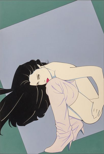
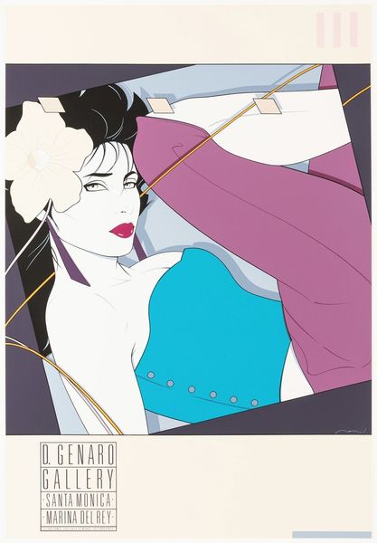
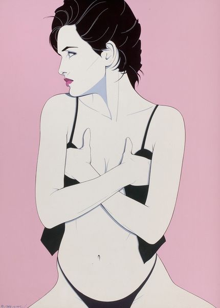
More like this