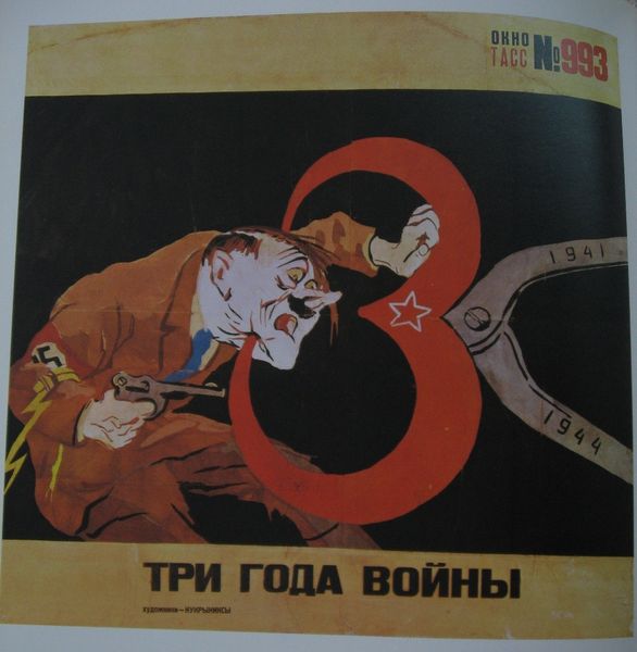
graphic-art, print, typography, poster
#
graphic-art
#
poster art
# print
#
rayonism
#
constructivism
#
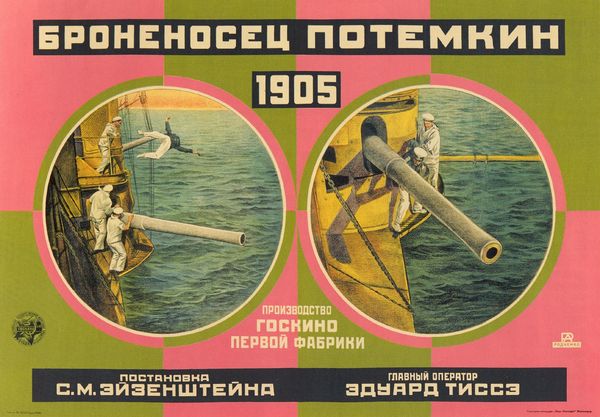
film poster
#
typography
#
geometric
#
abstraction
#
russian-avant-garde
#
poster
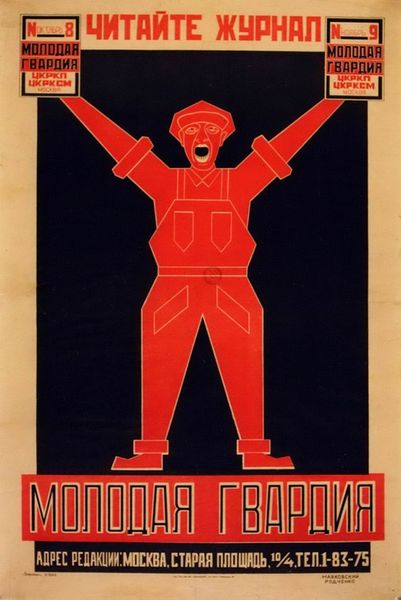
Copyright: Alexander Rodchenko,Fair Use
Curator: The work we're observing is Alexander Rodchenko's "Death Ray" from 1925, a striking example of Russian Constructivist poster art. Editor: It certainly has a forceful visual presence. Stark, geometric shapes dominating the composition—there's an immediate sense of graphic tension, all those sharp lines converging. It's very theatrical, stage-like even, the way that large central motif dominates the stage. Curator: Absolutely. Consider the title, “Death Ray.” Rodchenko was working within a culture deeply concerned with the promises and dangers of technology. The film the poster advertises likely tapped into those anxieties, which would explain this focus on decoding powerful images. Editor: I see what you mean. It’s interesting how this “ray” is translated into such strong diagonals. What's catching my eye, though, are the tangible details of its creation. It looks like lithography. Notice how those oranges and whites play against the deep black – the kind of density achievable through layers of ink on paper. Curator: And the way the symbols work. That large cross shape isn't a Christian cross, of course, but rather evokes a stylized industrial component—almost weaponized by the black fills. The “eyeglasses,” if that’s what they are, lend it a slightly satirical, mocking tone. It is also not far from what would be interpreted as hateful iconography a decade later. Editor: And there’s an ambiguity about its message that comes across as strangely seductive, or at least intriguing. Was it meant to promote this film to people? Curator: Precisely! Rodchenko, true to Constructivist principles, believed art should serve the revolution by engaging with mass media. Posters like this were vital tools for disseminating ideas. Even the typography is part of the design. Editor: I'm appreciating how those typographic elements aren’t merely captions but function as strong visual blocks, almost like structural support for the geometric composition. All very self-aware in its own artificiality. Curator: Examining Rodchenko’s “Death Ray” allows us to look closely into the dynamic intersection of art, ideology, and technological promise in early Soviet Russia. Editor: Right. Paying attention to the textures and choices embedded in printmaking—the kind of deliberate planning behind the medium itself opens a lens on its cultural context.
Comments
No comments
Be the first to comment and join the conversation on the ultimate creative platform.
More like this