drawing, ink, pen
#
portrait
#
drawing
#
comic strip sketch
#
imaginative character sketch
#
quirky sketch
#
cartoon sketch
#
figuration
#
personal sketchbook
#
ink
#
idea generation sketch
#
ink drawing experimentation
#
pen-ink sketch
#
sketchbook drawing
#
pen
#
storyboard and sketchbook work
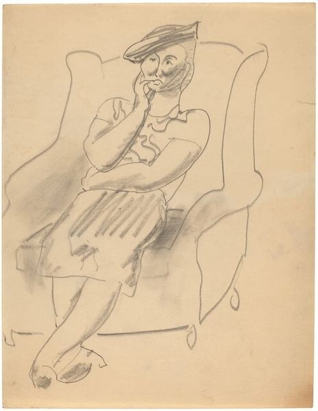
Dimensions: height 175 mm, width 144 mm
Copyright: Rijks Museum: Open Domain
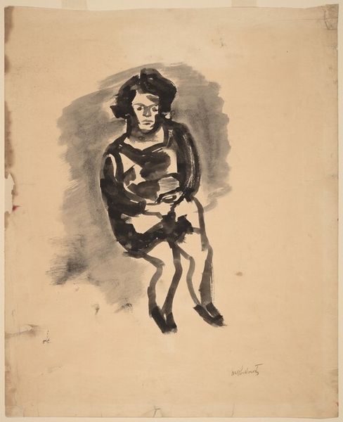
Curator: Immediately I’m struck by the dynamic simplicity of the composition! The heavy outlines give it this comic strip quality… Editor: Today, we're examining "Telefonerende jongen" or "Boy on the Phone," a work crafted with pen and ink sometime between 1928 and 1941 by Miep de Feijter. What grabs you about this particular image, specifically, within that style? Curator: The subject, balanced on the armchair, creates an almost performative element, raising questions about access to communication at that time, for children in particular. The phone becomes a symbol. Editor: Interesting that you hone in on the child. I noticed instead the geometric chair contrasting with the boy’s fluid lines. Observe how the harsh edges form an anchor for the sketch. The heavy pen strokes, especially around the chair and the child's shorts, establish depth and shadow, guiding your sight. Curator: It makes you wonder about the artist's intended audience. Was de Feijter reflecting on societal norms or the changing roles of children, especially regarding technologies that were then fairly novel? I mean, the sketch is very reminiscent of a scene you’d see on a card from that era. Editor: Or perhaps the line work served a practical need; quick lines, rapidly capturing this character and form from her memory. The simplicity almost argues against a complex societal interpretation. Curator: But doesn’t that assume a separation of art from its socio-historical context? Art is never created in a vacuum; every line, stroke, is influenced and, in turn, influences culture. And especially with caricature like this, there's usually some commentary embedded. Editor: Fair, though here the emphasis feels directed toward form rather than cultural statement. Still, an intriguing look at how context and composition can shape meaning. Curator: Absolutely, and by questioning the intended cultural function, we uncover fresh aspects to cherish about art.
Comments
No comments
Be the first to comment and join the conversation on the ultimate creative platform.
More like this