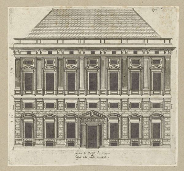
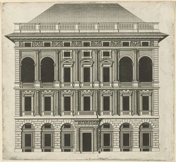
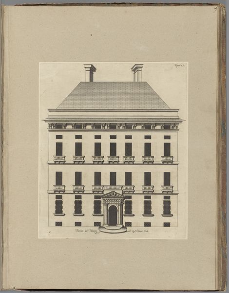
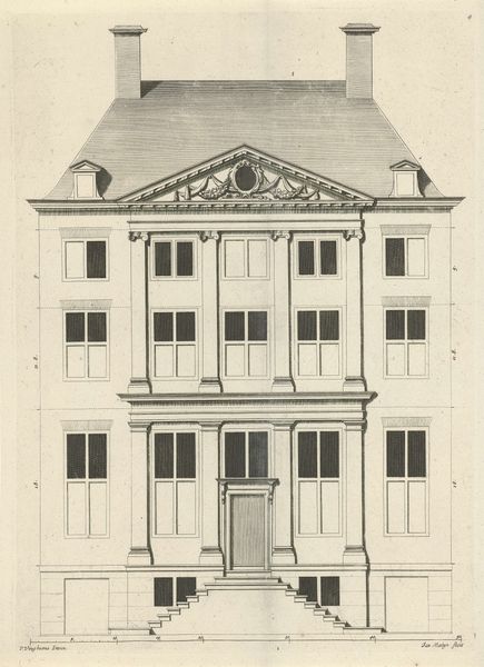
Opstand van de façade van het Palazzo Interiano Pallavicini te Genua 1622
0:00
0:00
nicolaesryckmans
Rijksmuseum
drawing, print, engraving, architecture
#
drawing
#
historical design
#
baroque
# print
#
form
#
geometric
#
line
#
cityscape
#
engraving
#
architecture
Dimensions: height 248 mm, width 213 mm, height 583 mm, width 435 mm
Copyright: Rijks Museum: Open Domain
Curator: This engraving, dating back to 1622, is titled "Opstand van de façade van het Palazzo Interiano Pallavicini te Genua," attributed to Nicolaes Ryckmans. The Rijksmuseum houses this fascinating rendering of a historical design. Editor: It's remarkably…stark. Almost sterile in its precise linearity. The rigid geometry definitely conveys a sense of austere grandeur, despite its monochrome palette. Curator: Indeed. Ryckmans captures the essence of the Palazzo’s facade through exacting lines and geometric form. Consider how he meticulously delineates the brickwork on the lower level. Editor: Absolutely. One can almost feel the weight of history, observing the meticulousness applied in portraying Renaissance-Baroque architectural elements; from cornices to window trim, but I'm compelled to consider what role the city itself played in influencing not only design sensibilities but artistic expression through socio-political means. Genoa at the time, known for rich mercantile trade likely shaped architectural trends and patrons' preferences in constructing grandiose buildings like this palazzo as reflections upon position through public portrayal within that society - so an essential study within such architectural works lies here through analysing power structures manifested concretely onto facades that interacted dynamically with both elites living inland behind tall doors also those public that gazed outwardly while going through its crowded city center. Curator: An intriguing point. Context deeply matters in viewing art’s relationship both inside artist perception alongside how audiences translate meaning around aesthetics shaped into societal value itself--but allow myself now just focus entirely the image by evaluating its proportional balance by meticulously constructing horizontal partitions created between distinct window placements balanced upon foundation walls as its rhythm resonates. Editor: Understood! It strikes me – are these stark lines purely aesthetic choice or function? Perhaps facilitating a dissemination method where these prints functioned by disseminating plans throughout Europe allowing easy duplication through line engravings which influenced local architectural trends/decisions too…! Curator: A pragmatic lens, to be sure. Certainly it raises thought from diverse corners concerning the role played when documenting urban growth’s transformation given constraints and opportunities when visual record merges into practical intent altogether while providing insights around historic building practice from cultural angles that can transform perspectives both aesthetically creatively as practical insights bloom during analysis through artistic perspective. Editor: It offers more to observe and analyze through artistic perspective beyond my casual view. Fascinating piece reflecting subtle societal interplay on facades. Curator: Agreed. The historical value interweaves compelling elements when viewed through formal artistry – allowing the drawing provide multi-layers to our considerations of baroque urban facades which offers deeper interpretations over our current experience from architectural past!
Comments
No comments
Be the first to comment and join the conversation on the ultimate creative platform.
More like this