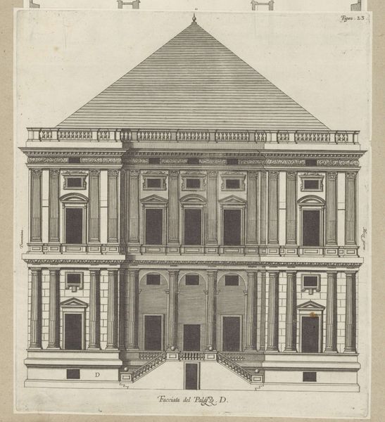
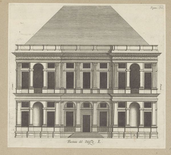
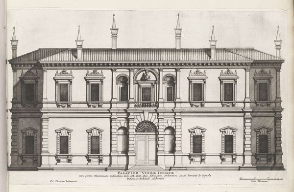
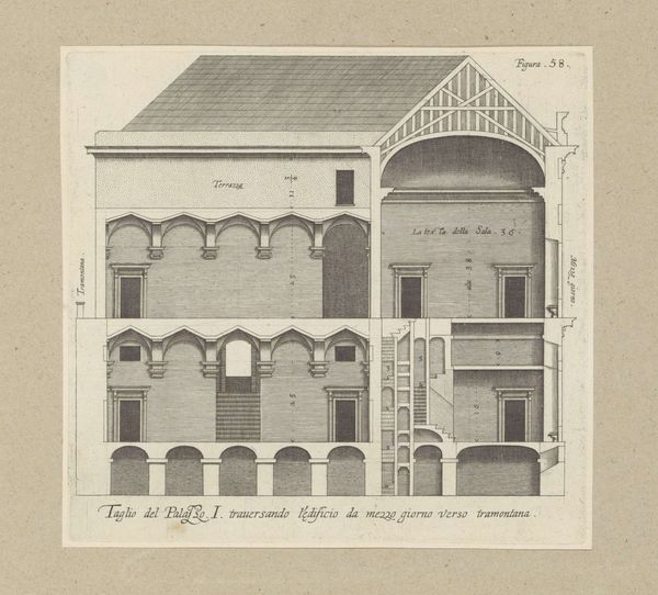
Opstand van de façade van de Villa Spinola di San Pietro te Genua 1622
nicolaesryckmans
Rijksmuseum
drawing, engraving, architecture
drawing
baroque
perspective
form
geometric
line
cityscape
engraving
architecture
Dimensions: height 274 mm, width 271 mm, height 583 mm, width 435 mm
Copyright: Rijks Museum: Open Domain
Curator: Here we have Nicolaes Ryckmans’ engraving, created around 1622, titled “Opstand van de façade van de Villa Spinola di San Pietro te Genua.” Editor: Well, it strikes me as an exercise in pure control. The rigorous lines, the relentless symmetry. It’s architecture tamed and put on display. Makes me feel a bit like I should stand up straighter, you know? Curator: The piece functions, primarily, as a meticulous exercise in representation. Notice how Ryckmans utilizes linear perspective, typical of Baroque sensibilities, to convey depth and architectural precision. The geometric rigor isn't merely aesthetic; it reflects the prevailing intellectual climate’s emphasis on order and reason. Editor: It’s orderly, all right. Almost oppressively so! The sheer repetition of those windows, the arches… like an assembly line of architectural features. Where's the soul in that, the… messiness of actual life? Curator: But that's precisely the point, isn’t it? This isn’t meant to depict “actual life” per se. It is a study in ideal form, in the potential for human intellect to impose structure upon the world. Semiotically, each line and shape communicates intentionality, control, and a celebration of form itself. Editor: Intellect is one word for it. Sterile is another that springs to mind. Though I confess, that severe pyramidal roof is strangely captivating. A peak looming like an abstracted mountain or a geometrical hat, makes my mind think of Italian landscapes. Curator: It’s the unexpected counterpoint, isn't it? That severe form disrupting what could otherwise be seen as tedious conformity. It forces you to reconsider the whole composition, which I think is Ryckmans’ stroke of genius, in an otherwise pretty by-the-numbers composition. Editor: I wouldn’t go quite so far as "genius," but I agree: without that angular lid, this façade would be simply forgettable. Instead, it plants itself into my consciousness. Makes me wonder if that bold stroke was even intended, you know? Serendipity sneaking into reason's perfectly drawn plans! Curator: An interesting perspective! Well, whether intentional or not, it certainly offers a disruptive element. The engraving stands as a testament to both the ambitions and the inherent limitations of rational design. Editor: Perhaps! For me, it hints that even in the most regimented creations, there’s always room for surprise…or the suggestion of one. A small but useful reminder when wandering halls filled with very precise artwork.
Comments
No comments
Be the first to comment and join the conversation on the ultimate creative platform.