Throwing the Hammer, from the Games and Sports series (N165) for Old Judge Cigarettes 1889
0:00
0:00
drawing, coloured-pencil, print
#
portrait
#
drawing
#
coloured-pencil
#
narrative-art
# print
#
coloured pencil
#
men
#
genre-painting
#
watercolor
Dimensions: sheet: 1 1/2 x 2 3/4 in. (3.8 x 7 cm)
Copyright: Public Domain
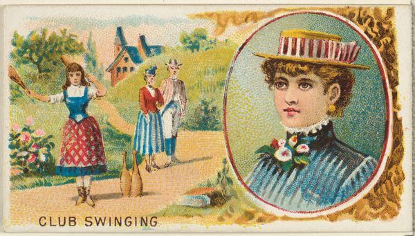
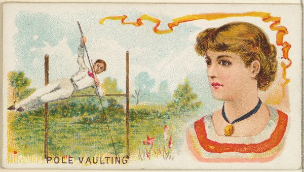
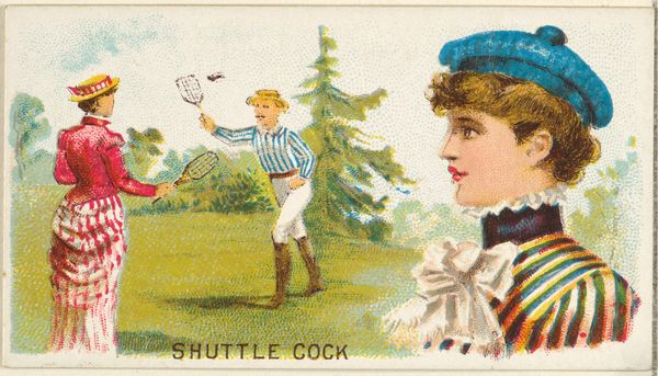
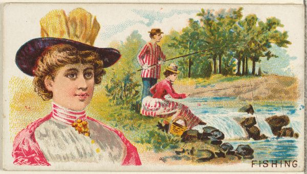
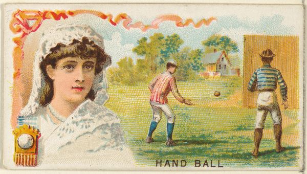
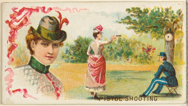
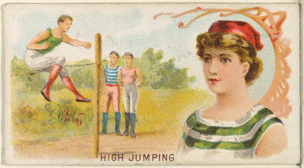
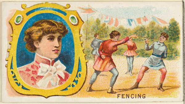
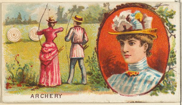
Curator: Here we have a peculiar piece, a baseball card from 1889 entitled “Throwing the Hammer” from the “Games and Sports” series for Old Judge Cigarettes. Goodwin & Company produced it, and the primary medium is colored pencil. Editor: Immediately, I'm struck by the duality of it. There’s this almost jarring contrast between the action scene in the background and the serene, detached portrait of a woman in the foreground. It's quite…unsettling formally. Curator: Right, it is. Contextually, this card emerges during a period when tobacco companies used such inserts to promote their brands. The series, featuring idealized versions of sports and the fashionable elite, reinforces connections between leisure, masculinity, and consumerism. Who is included, and who is not? Editor: The woman's gaze avoids any contact with the "action." Her striped outfit mirrors the sportsman’s jersey, linking them aesthetically while their disconnect emphasizes their differing roles. Note, though, how the pink ribbons behind her echo the trajectory of the hammer being thrown. Curator: It certainly makes me wonder about the roles of women in relation to sport during this era. Is she a spectator, a symbol of reward, or an objectified representation of a desired lifestyle sold alongside tobacco? She occupies a liminal space, physically present but seemingly uninvolved in the active display of masculine athleticism. Her placement also evokes broader social commentaries on the roles assigned to women in that era. Editor: Looking more closely, the perspective is off. The figures in the background lack a convincing sense of depth and the application of the color is flat, particularly in the grassy field. Curator: Yes, but perhaps that flatness speaks to the artwork's purpose. It’s a commercial piece meant to catch the eye, prioritizing easily legible images over true realism. Editor: True. It seems more about presenting ideals than capturing reality. By focusing on the clear shapes, and vivid contrast, any nuanced approach to depth of perspective is intentionally denied to heighten the sense of image as constructed idea. Curator: Examining it through a social and cultural lens alongside a close read of its construction truly does make this seemingly simple card into a multilayered piece. Editor: Indeed, I’ve gained a far greater appreciation for the nuanced approach to something I had initially seen as a simple advertisement.
Comments
No comments
Be the first to comment and join the conversation on the ultimate creative platform.
More like this