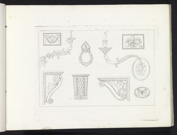
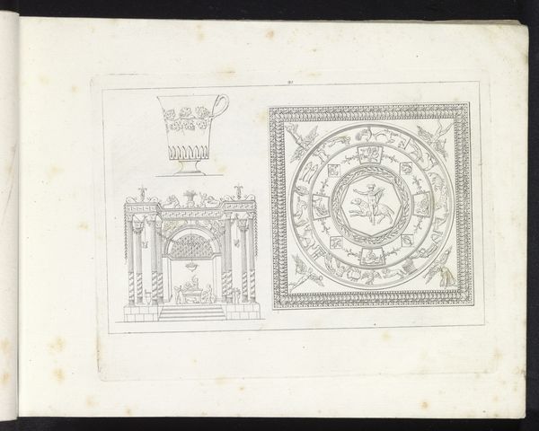
drawing, print
#
drawing
#
neoclacissism
#
script typography
#
hand-lettering
# print
#
hand drawn type
#
hand lettering
#
personal sketchbook
#
hand-drawn typeface
#
geometric
#
pen-ink sketch
#
line
#
pen work
#
sketchbook drawing
#
decorative-art
#
sketchbook art
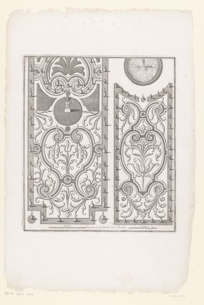
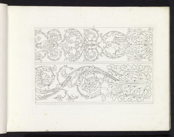
Dimensions: height 166 mm, width 215 mm
Copyright: Rijks Museum: Open Domain
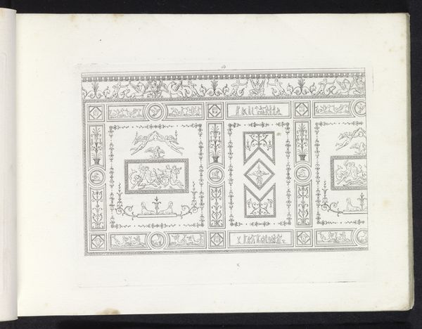
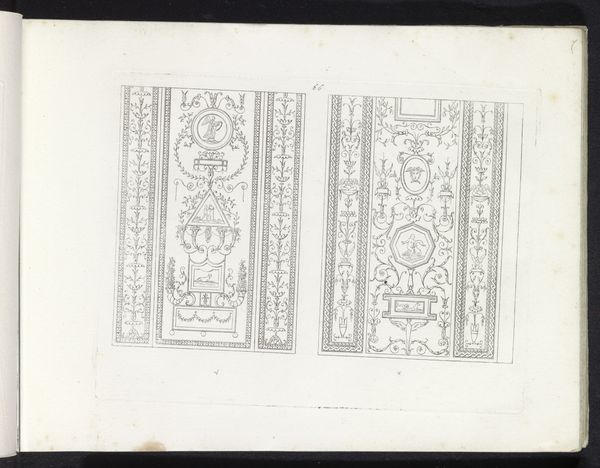
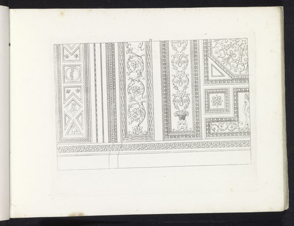
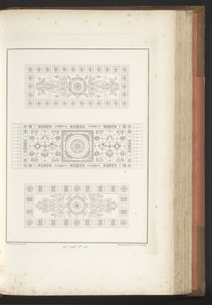
Editor: This work, "Twee ornementale panelen," or "Two Ornamental Panels," is an 1817 drawing by Pietro Ruga. It feels very architectural, like designs for ceiling decorations or perhaps tiled floors. The details are so precise! How might we interpret the symbolism used here? Curator: It's intriguing how these panels function almost as cultural palimpsests, isn’t it? Layered with symbols harkening back to classical antiquity. Notice the geometric shapes, they speak to the Neoclassical movement's fascination with order and reason. But consider too, how these patterns would resonate with viewers of the time. What existing visual language do you think they were fluent in? Editor: Well, given it's 1817, wouldn’t people still recognize some common Greek or Roman motifs? Like, weren't those still considered quite fashionable? Curator: Precisely. But think about it on a deeper level. Beyond mere fashion, what did those classical motifs *mean*? What aspirations, what sense of continuity were they meant to evoke in post-Napoleonic Europe? Were they reaching back for an age of stability and greatness? The images within tap into something deep. Editor: So, these aren't just pretty patterns. They're almost like… coded messages about power, history, and perhaps even a yearning for a different time? Curator: Exactly! It's like the artist is channeling a collective memory. Each carefully placed line, each flourish, resonates with the weight of centuries. Look, here's something I missed earlier -- is that perhaps the *caduceus* interwoven on the right side of the piece? This points to further layers of hidden meaning... can you see any further objects depicted here? Editor: I see stylized dolphins on the other design and a woman in what looks like classical garb. This emphasis makes it a time-capsule -- a window into how early 19th century artists and designers were re-imagining older histories to establish meaning within their work! Curator: Precisely! Each panel seems to echo this notion, but the two combined show different stylistic and historic interpretations of an old visual language.
Comments
No comments
Be the first to comment and join the conversation on the ultimate creative platform.
More like this