drawing, print, paper, ink
#
portrait
#
drawing
#
medieval
# print
#
paper
#
ink
#
history-painting
#
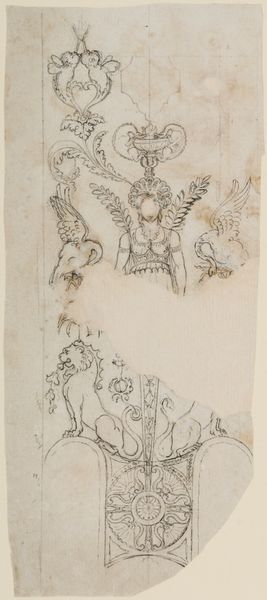
decorative-art
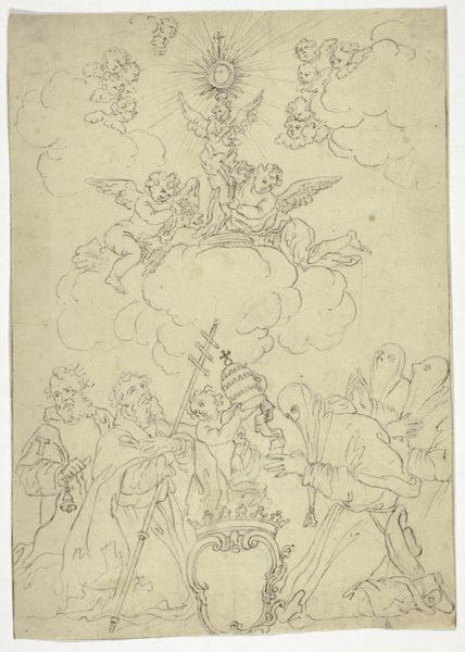
Dimensions: sheet: 10 3/16 x 7 5/16 in. (25.9 x 18.6 cm)
Copyright: Public Domain
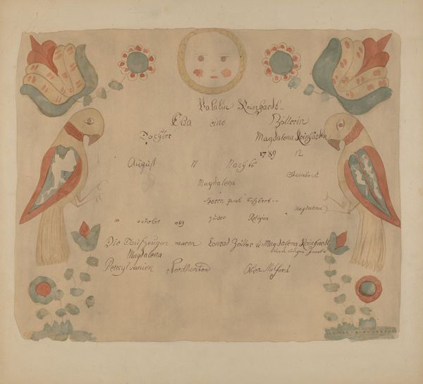
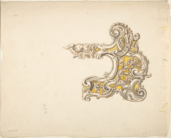
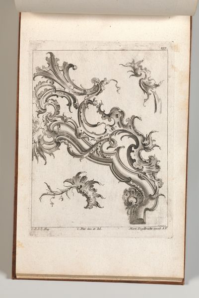
Editor: So, here we have an anonymous “Design for coat of arms,” dating from 1700 to 1800. It's a drawing in ink on paper and currently resides in the Metropolitan Museum of Art. What strikes me most is how delicate and detailed the linework is, especially considering its age. How do you interpret this work, focusing on its formal qualities? Curator: Precisely. If we consider only the artwork’s intrinsic properties, observe the complex symmetry employed. Note how the artist uses varied line weights to create depth and hierarchy. The crown at the crest and the central shield immediately command attention. Editor: I see that! And the placement of color, mostly on the flourishes around the central shield, seems deliberately restrained. Why do you think that is? Curator: Yes, notice the economy of color. Perhaps this emphasizes the underlying structure of the design itself, its purely graphic qualities. Consider the function of heraldry. It relies on clarity of form and symbolic relationships above all. Any added embellishment must amplify and not detract from the structural elements and clarity of the core symbolism, mustn’t it? The careful balance here speaks to an intentional aesthetic choice, and what seems to be only limited color accentuates other visual characteristics. Editor: That makes perfect sense! I never considered the functional aspect impacting the aesthetic so directly. This exploration into pure form and function makes me see heraldry in a whole new light. Curator: Indeed, focusing on these design elements reveals how form and purpose intersect in unexpected ways.
Comments
No comments
Be the first to comment and join the conversation on the ultimate creative platform.
More like this