drawing, print, engraving, architecture
#
drawing
#
neoclacissism
# print
#
old engraving style
#
geometric
#
19th century
#
line
#
engraving
#
architecture
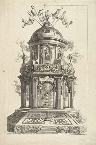
Dimensions: height 185 mm, width 118 mm
Copyright: Rijks Museum: Open Domain
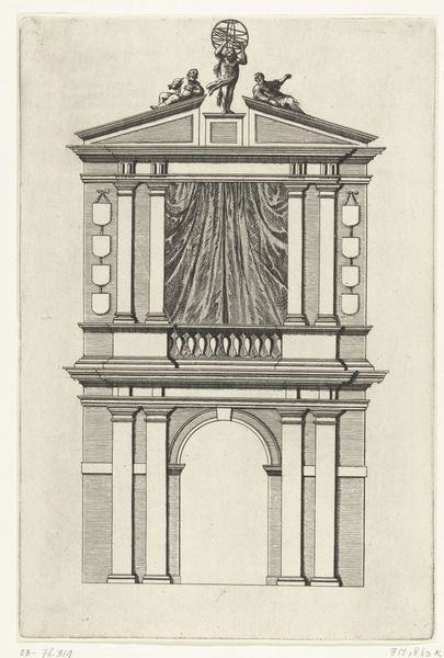
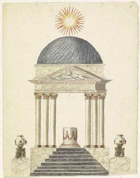
Curator: Let’s examine this engraving from around 1816–1817 by Antoni Zürcher, called "Erepoort aan de Haarlemmerpoort." Editor: It’s striking. Immediately, I’m drawn to the stark geometry, the precise lines—an almost ethereal quality conveyed in such a rigid structure. Curator: This piece, housed at the Rijksmuseum, exemplifies Neoclassical ideals. It speaks to a desire for order after a period of revolution and upheaval. The Haarlemmerpoort, one of Amsterdam’s main gates, was a key site for civic events. Zürcher presents it almost as a stage. Editor: Yes, and the linear perspective and repetitive forms of the columns, dome, and steps definitely create a theatrical sense of depth and space. The composition’s vertical symmetry reinforces a sense of stability and order. Curator: Indeed. But consider the politics of display—an entrance, usually a site of bustling activity, rendered here as an almost sterile, idealized monument. The inclusion of classical motifs speaks to a longing for a return to perceived golden ages of civic virtue and architectural perfection. Editor: The smoke rising from the braziers on either side intrigues me. It introduces a fleeting element against the permanence of the stone and serves as a visual counterpoint. There is a certain delicacy to this fleeting line. It really showcases the artist’s talent for etching and engraving. Curator: Absolutely. This print served as a potent reminder of Amsterdam’s historic grandeur and Dutch national pride during a time of considerable socio-political rebuilding after the Napoleonic wars. Images like these could subtly reinforce power structures. Editor: Seeing that starburst design topping the cupola—that burst of energy contrasted with all this rigidity and repetition...it gives the work an otherworldly and perhaps even uplifting feel to what otherwise would have been a bland statement. Curator: Precisely, and by contemplating that kind of complexity, perhaps we can grasp what a pivotal role visual representations play in forging public perception. Editor: The sheer precision, combined with that contrast, makes it an undeniably potent work for me. The artist clearly understands that less is more when communicating an ideal.
Comments
No comments
Be the first to comment and join the conversation on the ultimate creative platform.
More like this