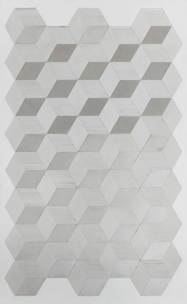
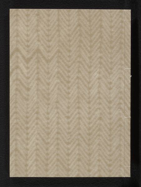
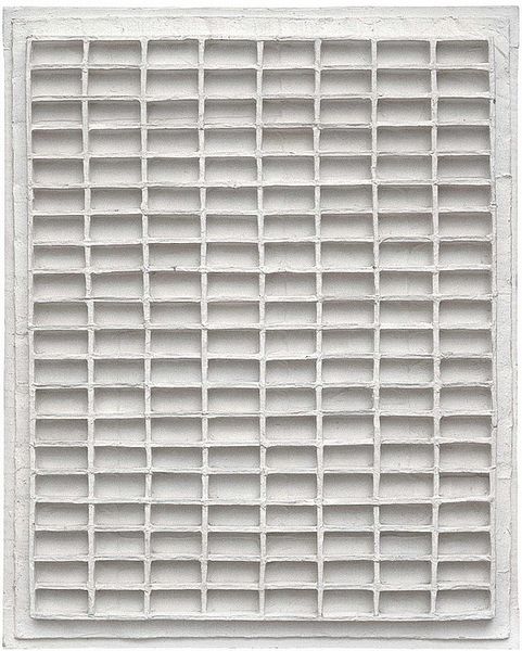
mixed-media, relief
#
mixed-media
#
concrete-art
#
minimalism
#
relief
#
paper texture
#
chalky texture
#
geometric
#
abstraction
Copyright: Johannes Jan Schoonhoven,Fair Use
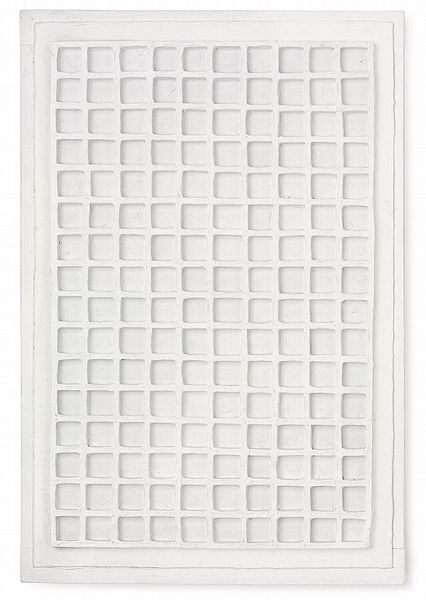
Editor: Here we have Jan Schoonhoven’s "Zeshoeken," created in 1968 using mixed media to form a relief. The geometric shapes and off-white palette create a calming, almost meditative effect, but the texture feels quite raw and handmade. What strikes you most about this piece? Curator: What I find fascinating is how Schoonhoven's work intersects with the socio-political context of post-war Europe. This monochrome, grid-like structure speaks to a desire for order and rationality, perhaps a reaction against the chaos of the war. But consider the handmade nature of it. Does the imperfect geometry hint at a tension between utopian ideals and the reality of human imperfection? Editor: That’s an interesting point. The rigid structure could be seen as a metaphor for societal control, but the slight variations in each hexagon undermine that sense of perfect order. Curator: Exactly. And what about the colour? Or rather, the *lack* of colour? This near-absence of colour challenges traditional notions of beauty and aesthetic value. Think about minimalism's broader impact: how it stripped away ornamentation and questioned the very essence of art. Is this artwork also making a statement about class? Perhaps about accessible beauty that avoids ornamentation? Editor: So, the monochrome palette, combined with the repeated geometric shapes, makes a statement about breaking away from traditional artistic values and even social structures? Curator: Precisely! It’s a quiet revolution. Schoonhoven invites us to reconsider what we value and how art can reflect and challenge the world around us. Editor: I hadn't considered that connection to societal change, it offers a fresh new context that shapes my perspective of the artwork. Curator: And hopefully, inspires more questions than answers!
Comments
No comments
Be the first to comment and join the conversation on the ultimate creative platform.
More like this