print, engraving
#
medieval
#
baroque
# print
#
pen illustration
#
old engraving style
#
cityscape
#
genre-painting
#
history-painting
#
engraving
#
realism
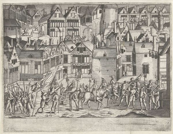
Dimensions: height 135 mm, width 175 mm
Copyright: Rijks Museum: Open Domain
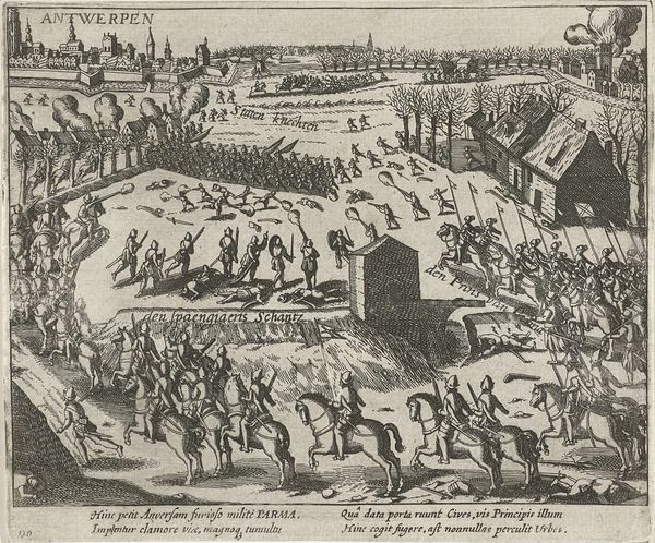
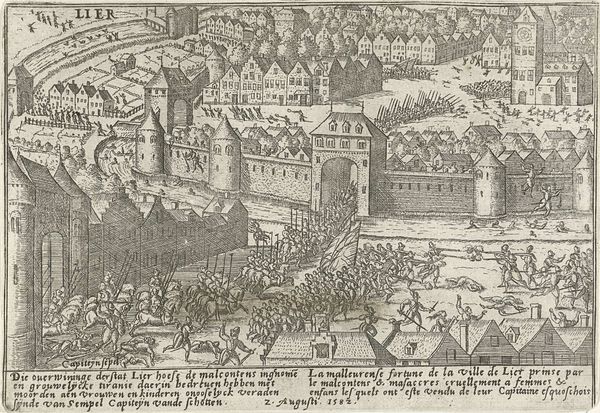
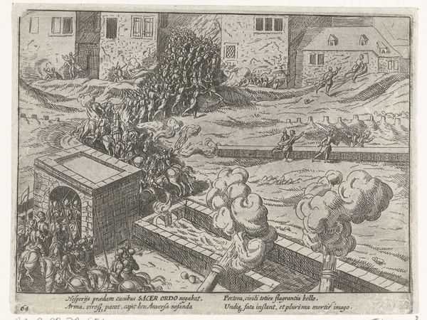
Curator: Good morning. Today we are looking at "Menen veroverd door de Malcontenten, 1578", an engraving dating from 1613-1615, now at the Rijksmuseum. It appears to depict a chaotic scene of conquest. The stark monochrome and detailed linework give it a very raw, immediate feeling. What are your initial thoughts? Editor: It feels very crowded and busy. What strikes me most is how the artist has organized so many figures and architectural details into a relatively small space, while still retaining clarity. What is most intriguing about this piece from a formal perspective? Curator: Indeed. Notice the dramatic use of contrasting light and shadow created solely through the engraving technique. Consider how the lines vary in thickness and density. Do you perceive how that directs the eye and creates a sense of depth and movement, despite the flatness inherent in the print medium? It directs your eyes across the composition following a broken path in a series of different shapes and tonal clusters. Editor: I see what you mean. The foreground figures are much more heavily rendered, pulling them forward and creating a tangible barrier. And those lines around the fleeing townspeople are so light. Is there perhaps a way in which the Baroque ideals of motion are achieved solely through such material effects? Curator: Precisely. The engraving medium necessitates that the illusion of dynamism comes purely from line and texture. Note also the careful placement of the figures in relation to the architecture – how the buildings frame and contain the action, contributing to a structured composition despite the seemingly disordered scene. The buildings thus contrast against the fleeing groups depicted as primitive and emotive. It gives great consideration to the effect on the beholder, don't you think? Editor: Yes, I never considered the ways in which the formal elements themselves carried so much weight within the larger picture. It makes the content almost seem secondary to the art of constructing a narrative through light and dark alone. Curator: Precisely so. It gives us a more refined consideration for both how artists depict these kinds of events in the history of art, but how even in the moment of crisis we can be attracted and calmed through its refined illustration.
Comments
No comments
Be the first to comment and join the conversation on the ultimate creative platform.
More like this