drawing, paper, ink
#
drawing
#
hand-lettering
#
hand drawn type
#
hand lettering
#
paper
#
personal sketchbook
#
ink
#
calligraphy
Copyright: Rijks Museum: Open Domain
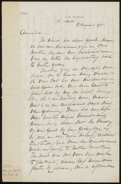
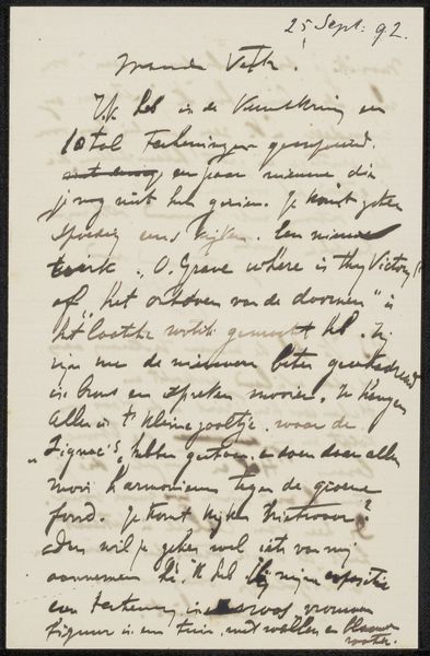
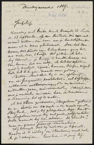
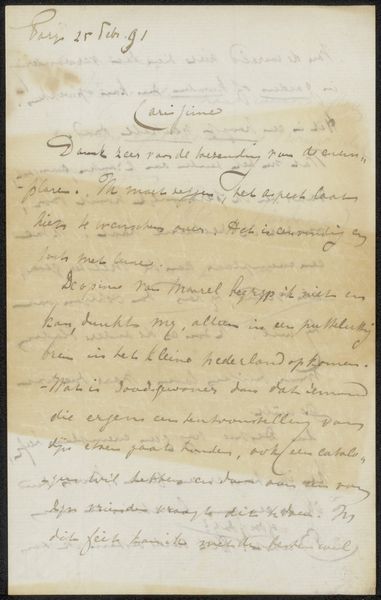
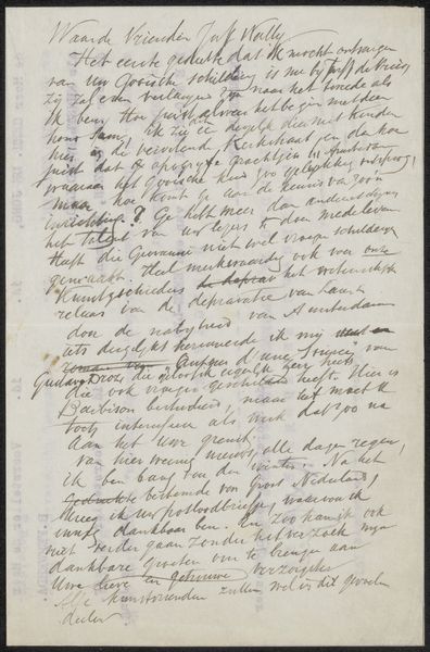
This letter, likely from 1896 and by Christiaan Hendrik Jacob van Niftrik, presents itself as a study in contrasts between form and function, line and legibility. Its overall visual field is dominated by the dense, vertical strokes of handwriting, a pattern broken only by the occasional flourish. The uniformity suggests a deliberate engagement with the act of writing itself. The letter's texture comes through the ink's varying densities, creating a relief-like quality on the page. This textural and visual rhythm serves a dual purpose: to convey information and to present a structured field of aesthetic interest. Semiotically, the handwriting operates as a system of signs, where each stroke signifies not just a letter but also a gesture, an index of the writer's hand and intention. The structural arrangement of these signs into words and sentences forms a complex code that demands decipherment. Consider the letter as a site where language becomes an object, and communication is intertwined with material presence.
Comments
No comments
Be the first to comment and join the conversation on the ultimate creative platform.
More like this