drawing, ink, pen
#
drawing
#
baroque
#
figuration
#
11_renaissance
#
ink
#
pen-ink sketch
#
pen
#
history-painting
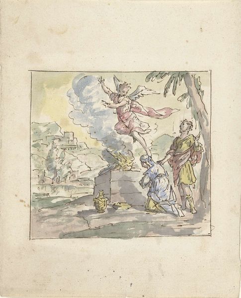
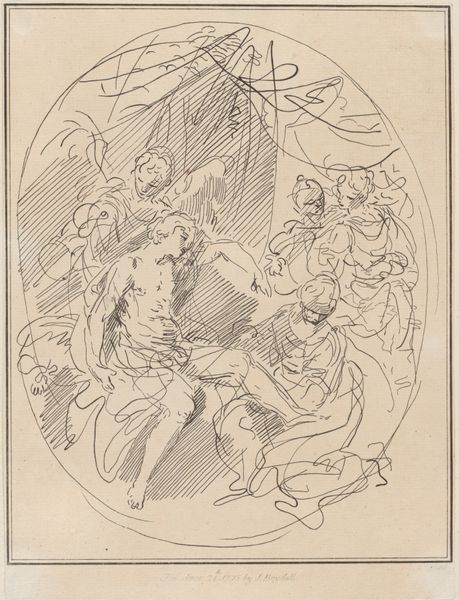
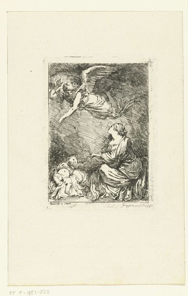
Dimensions: height 309 mm, width 208 mm
Copyright: Rijks Museum: Open Domain
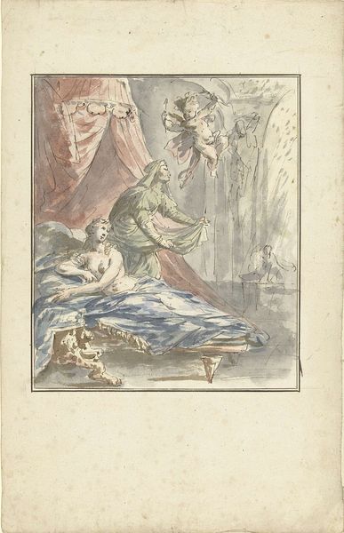
Editor: This pen and ink drawing, “The Sacrifice of Manoah,” attributed to Elias van Nijmegen and dating from 1677 to 1755, feels very dynamic to me, almost like a fleeting vision, owing to its Baroque style and sketch-like quality. What structural elements do you see as most significant? Curator: Note how the composition utilizes a clear hierarchy: the celestial figure dominates the upper register, drawn with bolder strokes, visually superseding the kneeling figures below. This division reinforces the divine/mortal separation, key to the biblical narrative. Observe the use of line – frantic and energetic – what does it suggest? Editor: That the artist wanted to show motion and drama, perhaps? Curator: Precisely. The hatching technique also merits attention. Consider its contribution to building form and delineating areas of light and shadow. Where is the light source? How does it impact your reading of the scene? Editor: It seems to come from above, highlighting the angel figure and casting long shadows that emphasize the awe-struck reactions of Manoah and his wife. It really adds to the theatricality. Curator: Indeed. The formal arrangement directs the viewer’s eye upwards, mimicking the couple’s gazes. It is a calculated design to evoke a sense of the sublime. Does an appreciation of the drawing’s inherent formal characteristics deepen your understanding? Editor: Absolutely. Focusing on these aspects really revealed how deliberately the artist crafted this dramatic, spiritual moment. Curator: And I have realized the genius of this baroque take on figuration through pen-and-ink, moving beyond merely rendering likeness to capturing intense emotion.
Comments
No comments
Be the first to comment and join the conversation on the ultimate creative platform.
More like this