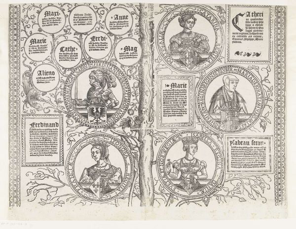
Curatorial notes
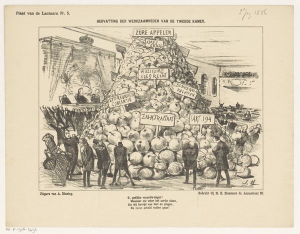
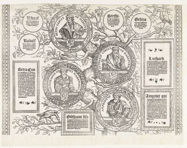
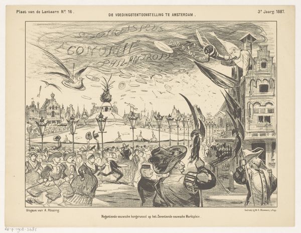
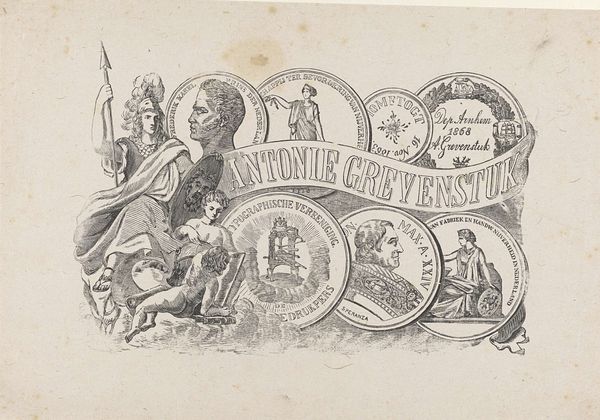
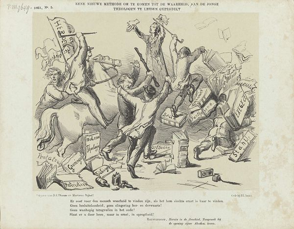
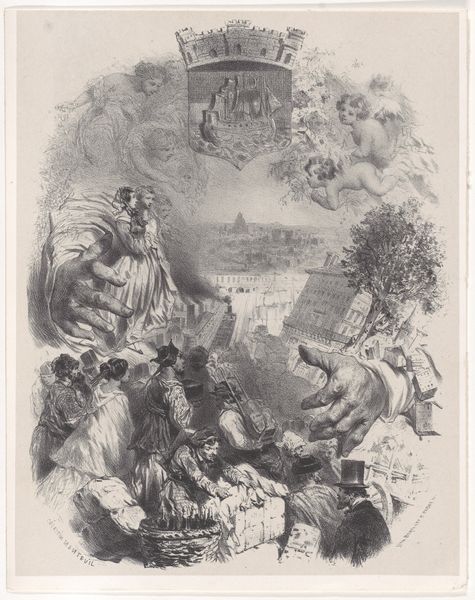
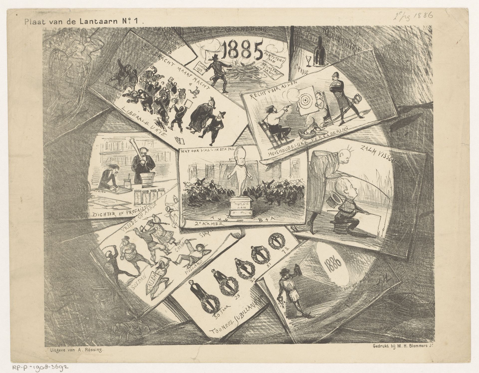
Curator: Here we have Jan Holswilder’s “Terugblik op 1885,” or “Looking Back on 1885,” created in 1886 using ink, graphite, and drawing techniques. It's an intricate piece, wouldn't you say? Editor: Oh, it’s absolutely chaotic—in a charming way! Like a scrapbook exploded and then someone tried to stitch it back together with nervous energy. All these little scenes crammed together. I’m getting a distinct sense of frenetic anxiety. Curator: The piece gives insight into Holswilder's cultural engagement, showing his interactions with printed media from 1885. Look closer—each image seems to reflect a specific event or theme that captured public attention during that year. Think about the newspapers, journals, and broadsides circulating at the time, informing public opinion. Editor: You're right, they're like tiny mirrors reflecting the world back then! Almost like visual shorthand, distilling larger political or social narratives into quick, digestible images. It makes me wonder about Holswilder's process. Did he meticulously collect these images or was he satirizing common tropes from the period? I see references to politics and public figures; that stout clergyman, the military scenes. Was this meant as humor? Curator: More than likely! Caricature was indeed Holswilder’s strength, with this style providing accessible cultural commentary for the emerging middle classes and an increasingly literate populace. The drawing itself acts as both a record and critique, shaping public memory. Editor: And look at the contrast! So many images deal with conflict, disagreement... then you see an image of celebration—"Jubileum". Did Holswilder consciously place opposing imagery for effect? I wonder what "Lantaarn" from "Plaat van de Lantaarn N° 1," printed above the drawing, signifies, especially juxtaposed with such personal content. The materials enhance this feeling—the immediacy of ink and graphite—like a newsreel in hyperdrive! Curator: Indeed. "De Lantaarn," a journal from the time, played an influential role in popularizing such accessible imagery. The physical making—the accessibility of ink and graphite—mirrors Holswilder’s accessible commentary on 1885’s shifting social structures. Editor: I like this glimpse into someone else’s "mind scrapbook." The raw energy here sparks curiosity about these forgotten dramas—little stories colliding into a bigger narrative of history observed through someone else’s eyes. Curator: An intimate peek, as we have discussed, that also broadens one’s view! Editor: Exactly. And that makes it pretty timeless in the end, wouldn't you say?