Copyright: Rijks Museum: Open Domain
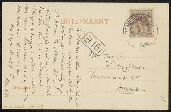
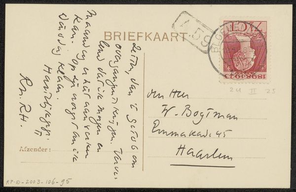
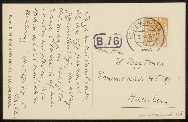
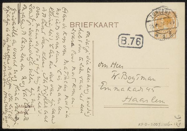
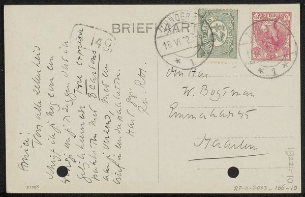
Editor: This is "Briefkaart aan Willem Bogtman" a postcard from 1926 by Richard Nicolaüs Roland Holst, made with ink and pen on paper. My first thought is about the text itself—it becomes a strong compositional element. How do you read this piece, focusing on the formal choices? Curator: Let's consider first the formal tension between the script and the image. We see varied stroke weights and line directions creating contrasting fields. Do you perceive a deliberate arrangement, despite its apparent randomness? Editor: It seems that way, the way the stamp is placed counter to the writing...yes, deliberate. Is it the layering of the words atop each other to create depth, almost like abstract shapes? Curator: Precisely! Consider the interplay between the stamp and handwritten address juxtaposed against the letter's dense body. These create planar relationships and direct the viewer’s eye across the surface. Roland Holst isn't just conveying a message; he's manipulating form through script. Is legibility the aim? Or does the text as image become a more prominent concern? Editor: Now that you point that out, it feels almost incidental to be able to read it, since it's about creating patterns. I see how the text works as textures, and then the stamp becomes a focal point, an interruption of sorts. Thanks for showing me how to consider even simple things like postcards as complex arrangements. Curator: Yes, these formal choices tell us so much about artistic intentions, the work then becomes about exploring possibilities of design itself!
Comments
No comments
Be the first to comment and join the conversation on the ultimate creative platform.
More like this