drawing, ink
#
drawing
#
art-nouveau
#
etching
#
ink
#
geometric
#
line
#
decorative-art
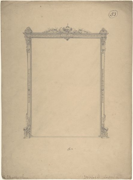
Dimensions: height 285 mm, width 219 mm
Copyright: Rijks Museum: Open Domain
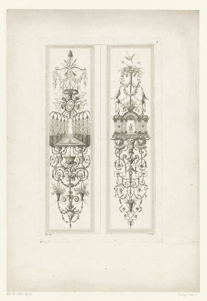
This 'Kader voor Elsevier's Geïllustreerd Maandschrift' by Reinier Willem Petrus de Vries looks like it was created in one sitting. The hand is confident and assured and the lines are bold and economical. The paper has a sheen and the ink sits on the surface, creating a subtle relief. The contrast between positive and negative space creates a kind of optical vibration. The design could be by Gustav Klimt. I love the way the frame interacts with the void. The shapes and motifs appear to blossom organically, like Art Nouveau vines. The symmetry is satisfying but not overly formal, there's a human touch, maybe the artist made subtle variations in the repeated elements? I am interested in how the piece engages with the concept of framing and enclosing. The outer perimeter of the design is clearly defined, but the interior space remains open and undefined. Ultimately, art is an ongoing conversation, it's like a game of telephone where meaning shifts and evolves. It asks us to embrace ambiguity and celebrate the multiplicity of interpretations.
Comments
No comments
Be the first to comment and join the conversation on the ultimate creative platform.
More like this