graphic-art, print
#
graphic-art
# print
#
pattern
#
decorative-art
Copyright: Public Domain: Artvee
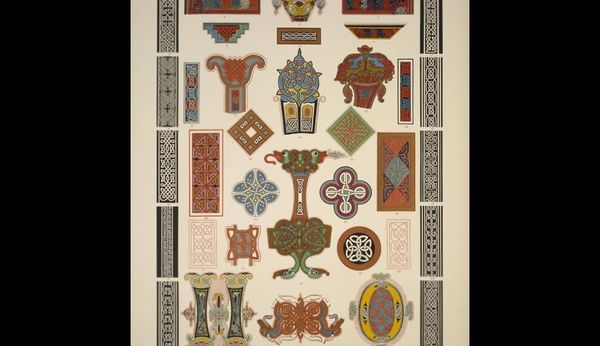
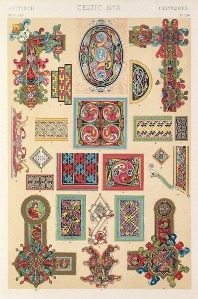
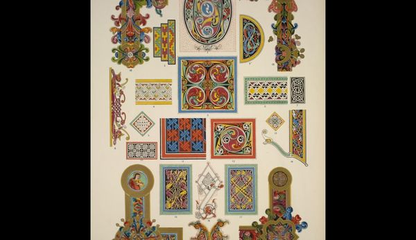
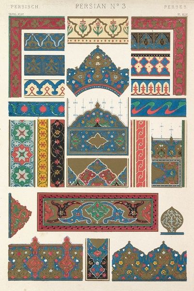
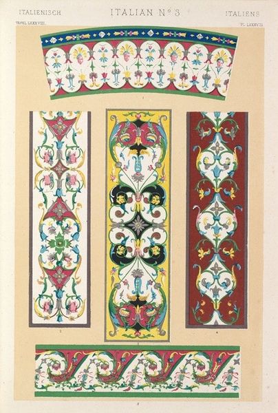
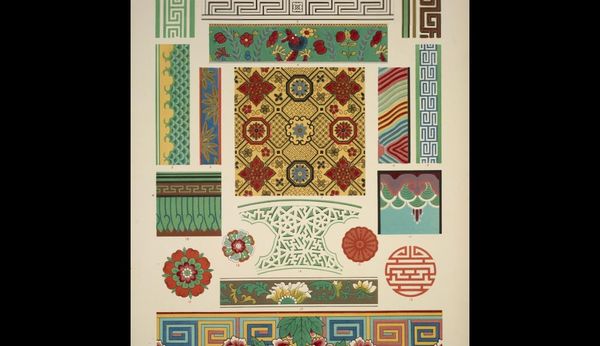
Editor: So, here we have Owen Jones' "Celtic No. 2" from 1856, a print showcasing various Celtic patterns. What immediately strikes me is the sheer intricacy of the designs. How would you begin to analyze something this complex from a formal perspective? Curator: I would start by deconstructing the visual elements, primarily the line. Notice how the lines intertwine and intersect, creating a sense of endlessness. Jones masterfully employs the knot motif, a hallmark of Celtic art. Consider also how the composition arranges discrete forms on a relatively neutral ground, emphasizing their shapes and their interplay. Editor: The use of color seems quite deliberate too, right? How does that play into the overall impact? Curator: Indeed. The colors, though varied, are carefully balanced. They highlight specific areas of the design, guiding the eye and reinforcing the overall symmetry. The contrast between the dark lines and the colored details accentuates the formal structure of each element. How do the various uses of bilateral or radial symmetry in these discrete forms change your reading of them, considered as a whole? Editor: I see that some forms become focal points with the use of color. It is like the visual weight distribution, leading you across the whole piece, not allowing a stagnant observation. Curator: Precisely. We see Jones is not simply replicating existing patterns; he's reinterpreting them through a refined formal lens. Editor: I can see that. Focusing on the formal aspects really helps appreciate the skill and artistry behind what I previously saw as "just patterns." Curator: It’s through that close analysis of form, and their interactions, that we truly understand an artwork’s inherent qualities and, ultimately, its power.
Comments
No comments
Be the first to comment and join the conversation on the ultimate creative platform.
More like this