#
natural stone pattern
#
3d sculpting
#
decorative element
#
3d printed part
#
detailed texture
#
jewelry design
#
sculptural image
#
unrealistic statue
#
3d shape
#
stoneware
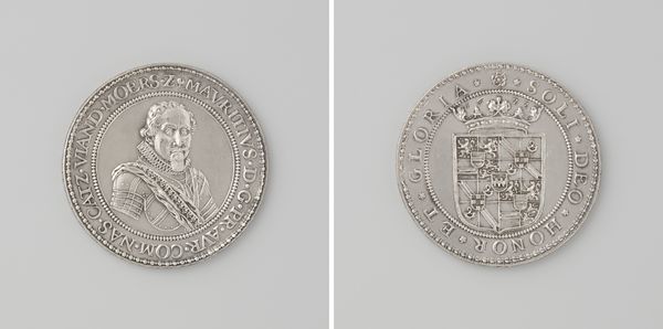
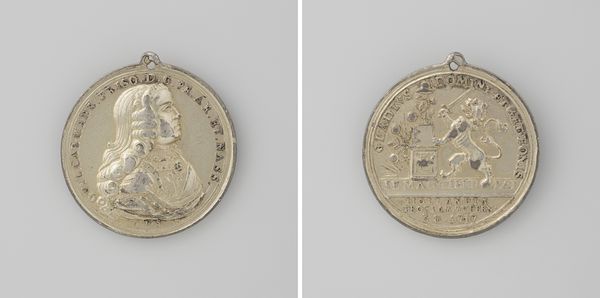
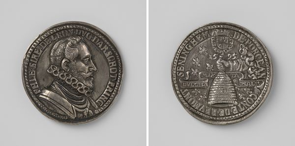
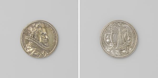
Dimensions: length 5.6 cm, width 4.5 cm, weight 44.54 gr
Copyright: Rijks Museum: Open Domain
Editor: This object is a silver medal from 1615 of Maurits, Prince of Orange-Nassau, made by Adriaen Symonsz. Rottermont. It is struck through with a tremendous symmetry – both sides perfectly capture the circular form, with details radiating from the center. What strikes you most about this piece? Curator: It’s precisely this visual harmony that arrests my attention. Observe the circular inscription on both sides. The lettering, meticulously arranged, emphasizes the rotundity, serving as a visual echo. Furthermore, the low relief sculpturing – consider the interplay of light and shadow that define Prince Maurits’ features – adds a textural richness, further complicating its formal properties. Editor: I do appreciate how contained the detail is! The symmetry works well given how much information it's communicating. How do you consider the negative space? Curator: Precisely! The background is crucial. It is not merely an absence of form but a compositional element, allowing the detailed inscription and sculpted portrait to truly come forward. Observe how your eye constantly traces the perimeter of the circle before landing back onto the Prince. A closed circuit. Do you find this creates a sense of confinement? Editor: Now that you mention it, maybe? There's certainly nowhere to look *except* at the intended focus. I wonder how much that decision was made based on what's effective vs. what's tradition. Curator: An interesting inquiry. What seems paramount, then, is this object's formal effectiveness: the unified design, balanced relief, and cyclical arrangement coalesce into an image of contained power. The effectiveness supersedes its symbolic intention; its function stems directly from its visual vocabulary. Editor: That’s fascinating; I never would have noticed these nuances. Thank you for opening my eyes! Curator: It is in attentive observation that we begin to decode and comprehend; I, as well, have enjoyed considering it.
Comments
No comments
Be the first to comment and join the conversation on the ultimate creative platform.
More like this