drawing, pencil, graphite
#
drawing
#
landscape
#
pencil
#
graphite
#
pencil art
#
realism
Copyright: Rijks Museum: Open Domain
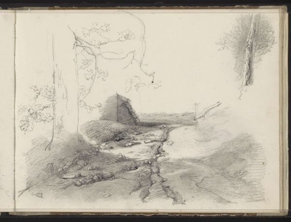
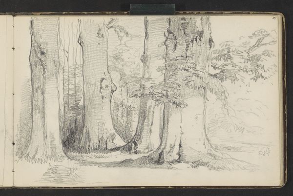
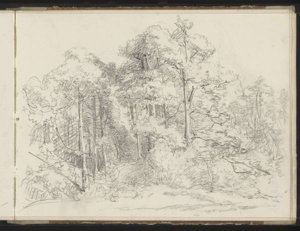
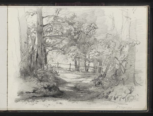
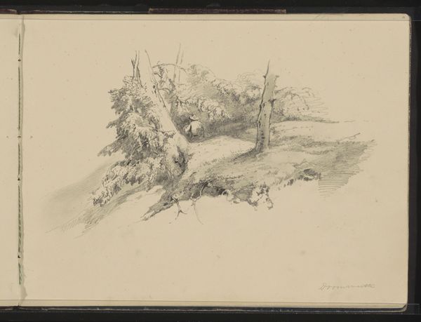
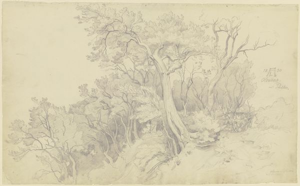
Editor: So, this is "Beek bij Doorwerth," a graphite drawing by Maria Vos, around 1864-1865. It feels incredibly detailed, even for such a small piece, almost dreamlike. What formal qualities stand out to you? Curator: Note how Vos skillfully uses the graphite to establish spatial relationships within the composition. Consider the light – how it filters through the canopy, creating varied tones that model the forms. There's a sophisticated interplay of line and shadow; see how the density of the marks defines the receding plane. Do you see how that establishes depth? Editor: I do! It’s almost like she’s using the varying shades to pull you into the depths of the forest. And the reflections in the water? It adds another layer. Curator: Exactly. Notice how the reflections, rendered with subtle gradations, mirror and invert the scene, flattening pictorial space. The composition itself directs the eye— from the lower tonal values up to the apex in the centre. Consider also how the materiality of the drawing—the tooth of the paper, the marks left by the pencil— contribute to the overall aesthetic experience. Does that resonate with you? Editor: It makes me appreciate the drawing on a more technical level! I was initially drawn to the overall scene, but looking closer, I am really blown away by the subtle formal details you pointed out. Curator: Indeed, Maria Vos really demonstrates exceptional control over tonal range within a rather narrow register. Editor: It gives you a much richer appreciation for the artist’s eye and technique. Curator: Precisely! Understanding the artist's formal decisions grants one deeper insight into the drawing.
Comments
No comments
Be the first to comment and join the conversation on the ultimate creative platform.
More like this