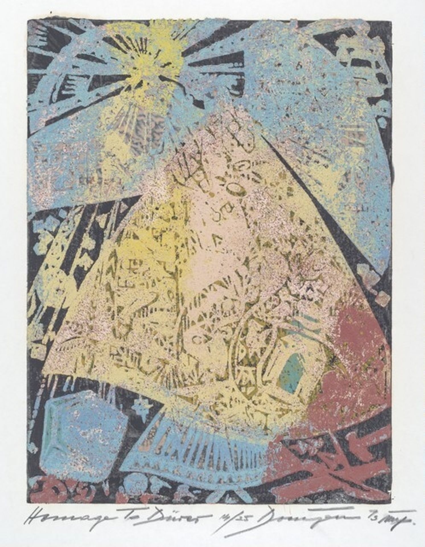
1972
Homage to Durer
Listen to curator's interpretation
Curatorial notes
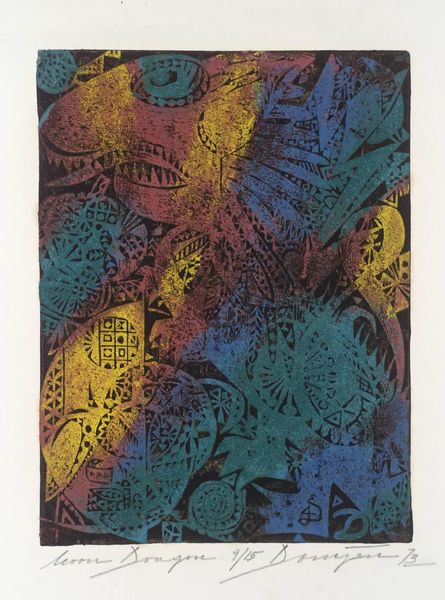
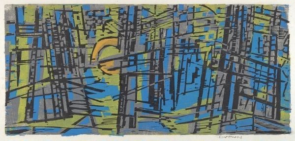
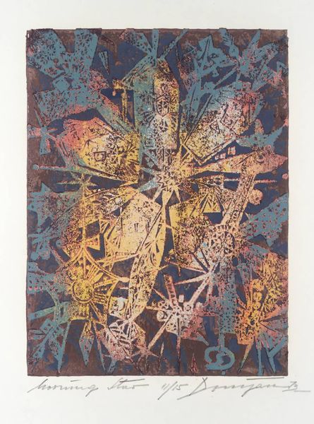
This is Jozsef Domjan’s Homage to Durer, a print made sometime in the 20th century, in which Domjan uses a playful range of techniques and a muted colour palette to create a sense of layered complexity. The composition revolves around an implied central triangle that gives the print a solid grounding. The texture of the print is intriguing; it’s got this granular, almost sandy feel, which I bet comes from the wood grain of the printing block itself. Domjan doesn't try to hide his process here, instead, he seems to embrace the material qualities of the woodcut, adding depth and a kind of tactile quality to the image. The colours he uses, muted blues, yellows, and reds, are all slightly desaturated, which gives the print an antique feel, as if it's been aged by the sun, faded by time. There’s something almost like a sunburst in the upper part of the image. Maybe this is a metaphor for the light of inspiration. Thinking about how artists can rework older ideas, I'm reminded of Elizabeth Murray's colorful, cartoonish shapes and how she created these madcap puzzles that never quite resolve. There's no one way to read a picture, and I think Domjan knew that.