Curatorial notes
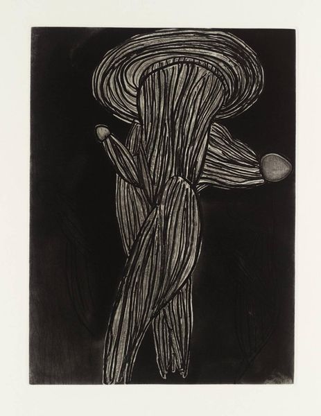
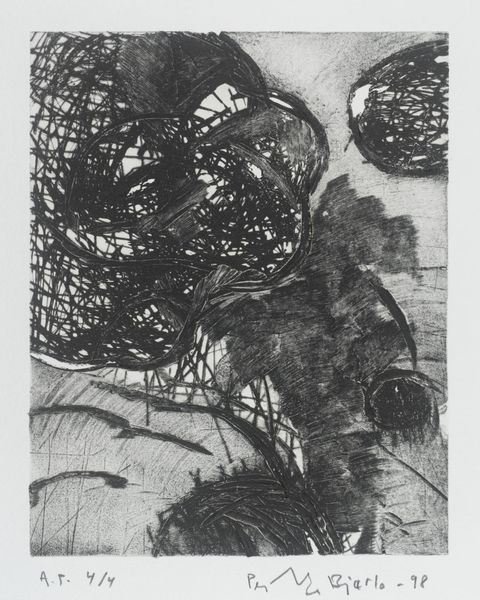
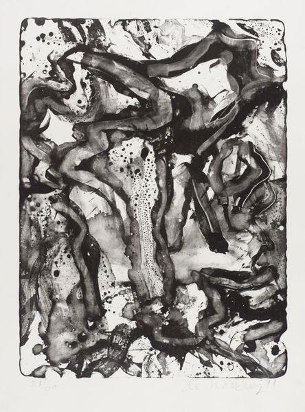
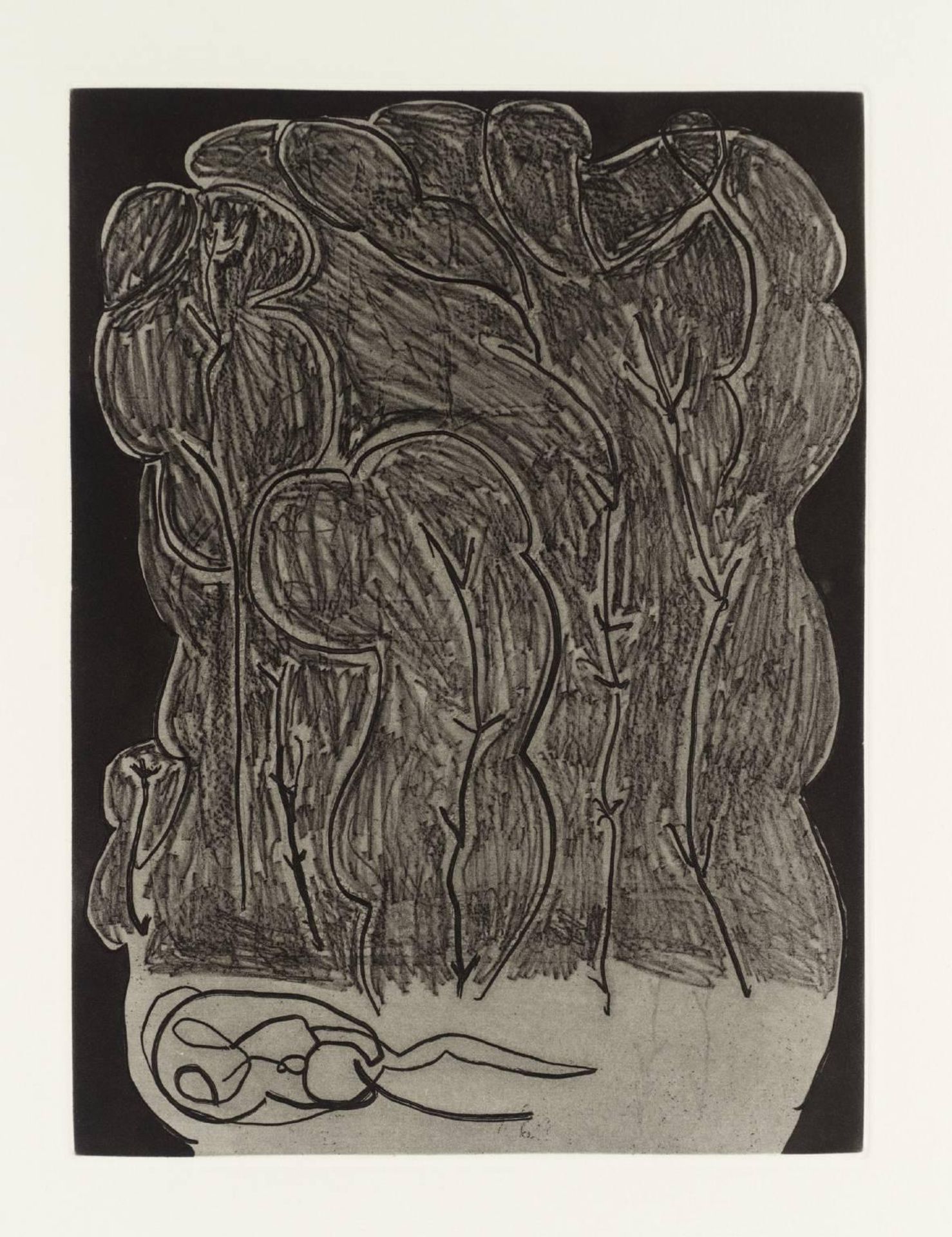
Editor: Here we have Terry Winters' "Field Note (23)". I'm struck by its textured surface and the almost fungal forms depicted. What visual elements stand out to you? Curator: The interplay of positive and negative space is most compelling. Note how the dense, organic mass at the top contrasts sharply with the linear forms below. What function do you think the artist intended for this contrasting structure? Editor: Perhaps to create tension and visual depth? Curator: Indeed. The lithographic technique further enhances this tension through its unique textures and tonal gradations, lending a tactile quality to the biomorphic shapes. It’s a study in contrasts, wouldn't you agree? Editor: Absolutely, thank you for highlighting those elements. Curator: My pleasure. It's through this formal analysis that the work's inherent qualities become more apparent.