acrylic-paint
#
pop art
#
acrylic-paint
#
geometric
#
abstraction
#
pop-art
#
line
#
hard-edge-painting
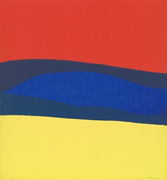
Copyright: Nicholas Krushenick,Fair Use
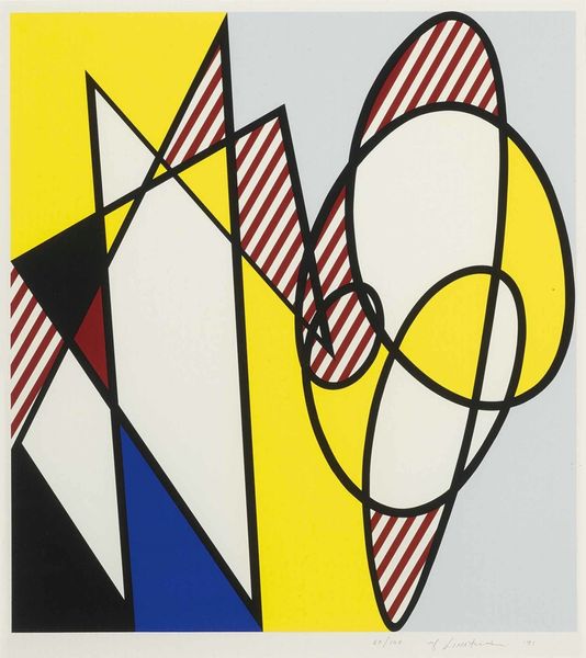
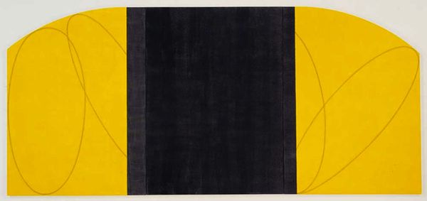
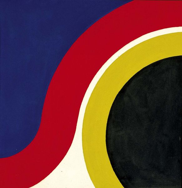
Editor: So, this is Nicholas Krushenick's "Untitled" from 1961, done with acrylic paint. The sharp lines and bold colors—yellow, blue, black, and white—make it feel very graphic and almost like a simplified landscape. What jumps out at you when you look at it? Curator: I immediately think about its place within the trajectory of Pop Art. Krushenick, although sometimes overlooked, played a crucial role in pushing abstraction in that direction. These hard-edged forms and flat colors reject traditional notions of artistic expression, almost like mass-produced imagery. Do you think the use of these simple forms and colors was in conversation with the growing commercialism of the 1960s? Editor: Definitely! The limited palette and clear lines feel almost like a brand logo. So, you’re suggesting this work comments on how art was becoming, in a way, a product itself? Curator: Exactly! Consider the socio-political climate. The rise of consumer culture, the Cold War, anxieties about mass production - all fueled the artistic responses we see in Pop Art. Krushenick's clean lines and basic shapes weren't just aesthetic choices; they reflected a broader cultural shift questioning originality and the role of the artist in society. This aesthetic distances the author from a supposed originality of expression, and in doing so it asks where authenticity can be found in an industrializing society. Does this flatness and simplicity change how we experience the artwork? Editor: Absolutely. Knowing the context really reframes the way I see it. What seemed like a basic abstract piece now reads as a statement about its time. Thanks for the insight! Curator: My pleasure. Thinking about art in relation to its social and political context always unlocks new meanings and expands our understanding of its relevance.
Comments
No comments
Be the first to comment and join the conversation on the ultimate creative platform.
More like this