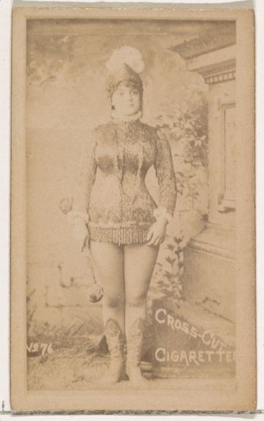
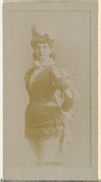
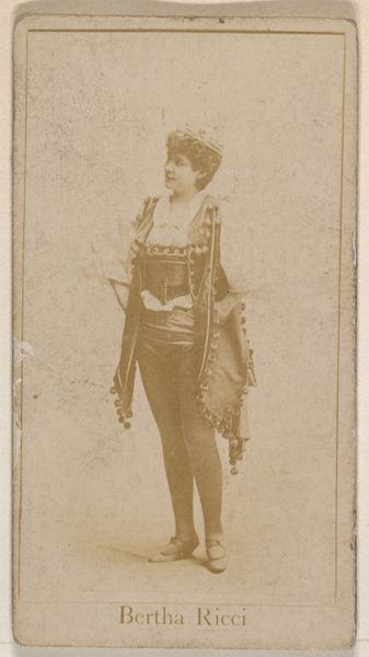
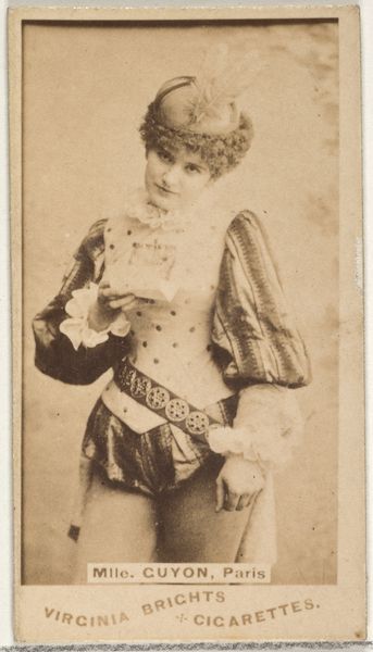
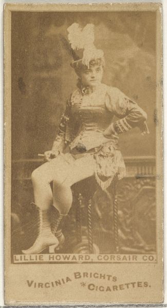
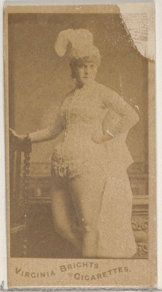
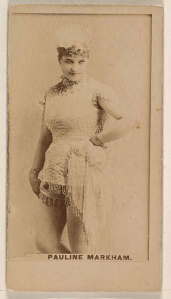
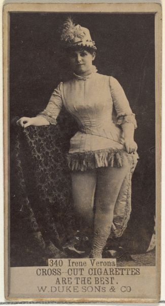
Card Number 204, Pauline Hall, from the Actors and Actresses series (N145-2) issued by Duke Sons & Co. to promote Cross Cut Cigarettes 1880s
0:00
0:00
drawing, print, photography
#
portrait
#
drawing
# print
#
photography
#
genre-painting
Dimensions: Sheet: 2 5/8 × 1 7/16 in. (6.6 × 3.7 cm)
Copyright: Public Domain
Editor: Here we have "Card Number 204, Pauline Hall," a promotional print from the 1880s for Cross Cut Cigarettes. It's a fascinating piece, a small photographic print with additional illustrative elements. I'm struck by the contrasts in texture, and the subject's coy gaze. How do you see this work? Curator: Intriguing. The initial semiotic reading presents us with oppositions: advertising juxtaposed against art, photography with graphic design, and the interplay of visibility and concealment in Pauline Hall’s presentation. Structurally, note the geometric containment; the figure, positioned centrally, exhibits a certain tension with the sharp corners and defined edges of the card format itself. What’s implied by the visual push and pull? Editor: I see what you mean about the tension. It feels very deliberate, now that you point it out, like the rigid frame is almost restraining the image within. Curator: Precisely. The composition isn't merely representational; it’s performative. The diagonal text competes with the horizontality of the card itself. Notice also the values used; the almost monochromatic palette relies on minute tonal shifts to generate contrast and delineate form, achieving both depth and flattening simultaneously. Editor: I'd not thought about the interplay between depth and flattening - very cool! How much do you think that tension impacts the overall experience of the image? Curator: Critically. The lack of a dynamic range, the flatness versus the photographic nature of the piece pushes the viewer to seek meaning not in depth of field, or photorealism, but within the design choices of W. Duke, Sons & Co., shifting the attention from subject to intent. Editor: It makes me consider more intently what it communicates, outside its subject's charm. Curator: Absolutely. By considering it from that formal perspective, the piece transcends simple portraiture and enters into dialogue with ideas about consumer culture and its construction of identity. Editor: So much to think about, all within this tiny card! It’s prompted a completely different line of inquiry for me. Curator: And that, perhaps, is the essence of engaging with art; to re-evaluate, reconsider, and thus redefine understanding.
Comments
No comments
Be the first to comment and join the conversation on the ultimate creative platform.
More like this