#
pencil drawn
#
photo of handprinted image
#
yellowing
#
aged paper
#
toned paper
#
light pencil work
#
parchment
#
light coloured
#
white palette
#
watercolor
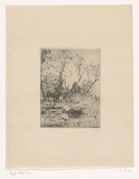
Dimensions: height 220 mm, width 152 mm, height 344 mm, width 263 mm
Copyright: Rijks Museum: Open Domain
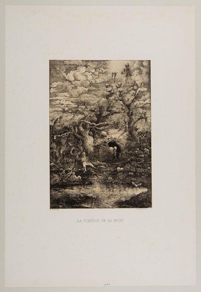
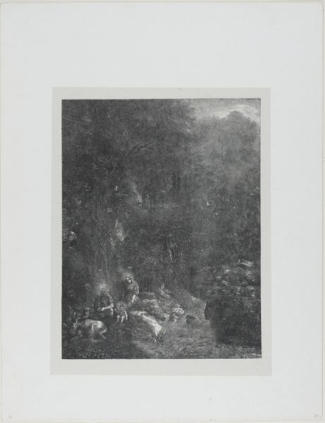
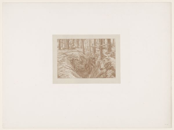
Editor: So, here we have Rodolphe Bresdin’s “Komedie van de Dood,” made sometime between 1854 and 1861. It looks like it’s a print, judging by the delicate lines. It feels incredibly intricate and maybe even a little… foreboding? What do you see in this piece? Curator: "The Comedy of Death," as it translates, presents a landscape teeming with both decay and life. Notice the density of the composition – the forest, the water, even the sky, all feel crowded. How do these densely packed symbols affect you? Editor: I guess it does give a sense of everything pressing in, almost suffocating. There are so many things I recognize, like skulls, but I am also overwhelmed by everything else. Curator: Exactly. These aren’t just arbitrary details. Consider the trees – gnarled, old. Think of them as symbolic witnesses. What memories do they carry? What do the animals tell us? The vulture has very different associations than, say, the little birdies up top! Editor: That’s true. The juxtaposition of life and death is pretty overt, but thinking of it as a "comedy" makes me question what is being satirized. The vulnerability of life perhaps? Curator: Precisely! Death becomes the great leveler. Look at how the light falls – creating a sense of drama. How does this interplay of light and dark inform your understanding of the scene? Bresdin is urging us to confront uncomfortable truths. Editor: I see what you mean. The image seems less bleak when it's framed as a critical observation of life, instead of a lament for death itself. Curator: Yes! This darkly comic perspective offers a unique lens through which to examine our own fleeting existence. The image is much richer knowing this!
Comments
No comments
Be the first to comment and join the conversation on the ultimate creative platform.
More like this