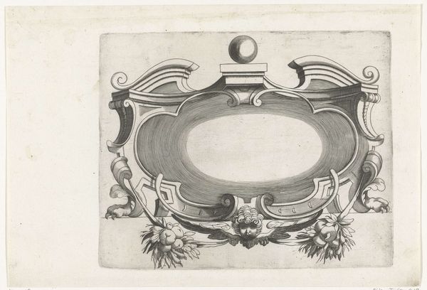
drawing, print, metal, sculpture, engraving
#
drawing
#
allegory
#
baroque
# print
#
metal
#
figuration
#
sculpture
#
cityscape
#
engraving
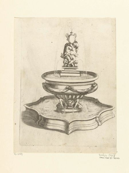
Dimensions: height 147 mm, width 161 mm
Copyright: Rijks Museum: Open Domain
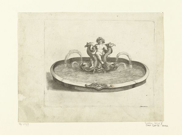
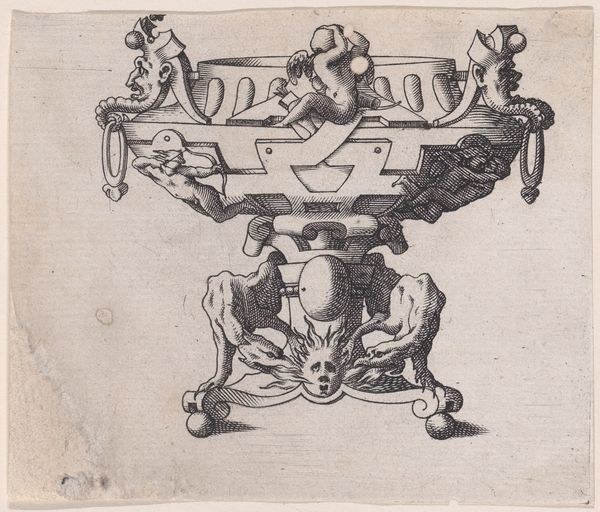
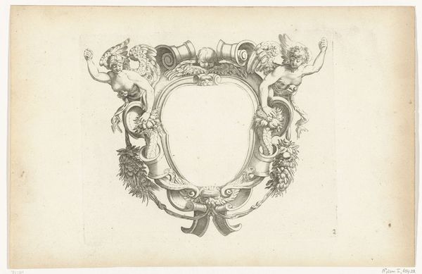
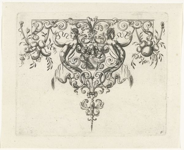
Curator: What strikes you most about this work, right away? Editor: Whimsy! The artist—anonymous, as the museum tells us—truly captures the lightness of Baroque playfulness in "Fontein met twee putti naast waterspuwende dolfijn," which roughly translates to "Fountain with two putti beside a dolphin spewing water." Curator: The execution is fairly simple, though, wouldn't you say? A carefully engraved print, likely from somewhere between 1680 and 1707, showcases a proposed public fountain. There is no colour to distract the eye. Line and form take precedence. Editor: That constraint becomes its strength. Look how the artist coaxes so much volume and life out of those stark lines. The cherubic *putti* practically burst from the page, all chubby limbs and mischievous grins! I can almost feel the spray of that cheeky dolphin. Curator: It’s quite successful in depicting depth and texture through varied engraving techniques. Notice the meticulous cross-hatching creating the illusion of shadow and volume, especially on the fountain’s base. Also the conscious decision to add those architectural notes suggesting this is meant to be a real structure rather than just a fancy idea on paper. Editor: Which circles back to that playful heart! Even though it's essentially an architectural drawing, it prioritizes pleasure, life, exuberance. I love how those little *putti* seem utterly absorbed in their watery game, blissfully unconcerned with grand statements or symbolic weight. Do you agree it reminds you of the decadence, of say, Versailles? Curator: I can see how one might draw that parallel. Yet here, stripped bare of the lavishness of color and setting, the pure mechanics of Baroque artistry become magnified. Ornament becomes structure, and structure winks at the viewer. The reduction allows closer analysis of the intent. Editor: See, for me, it's a permission slip—a reminder that art, even functional art, should spark joy, first and foremost. It’s beautiful to imagine that almost three hundred years ago someone saw the value of everyday wonder! Curator: Perhaps we can find joy even in sober analysis.
Comments
No comments
Be the first to comment and join the conversation on the ultimate creative platform.
More like this