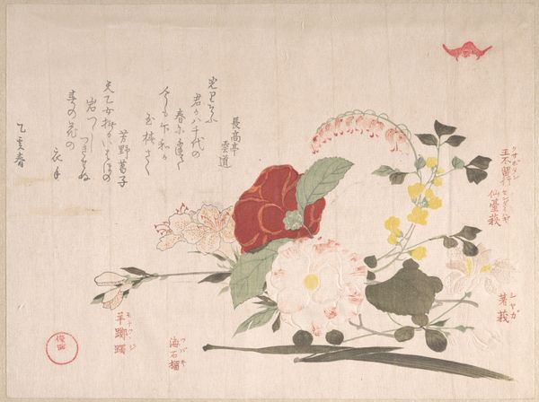
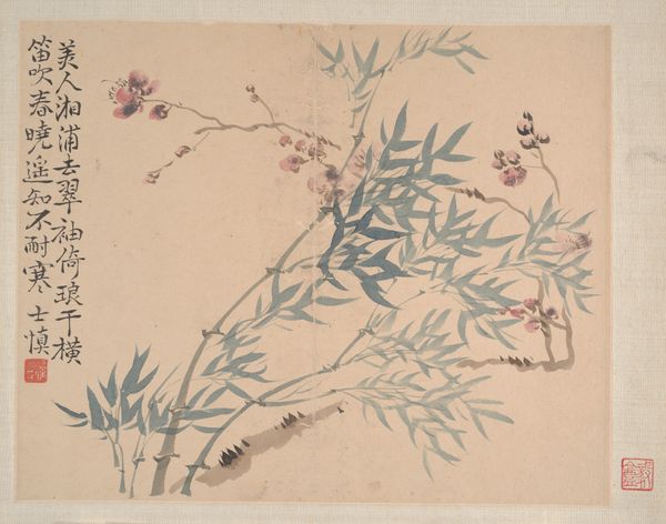
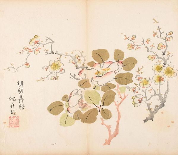
Page from the Ten Bamboo Studio Manual of Painting and Calligraphy 1633
painting, print, paper, ink, woodblock-print
painting
asian-art
paper
22_ming-dynasty-1368-1644
ink
woodblock-print
china
watercolor
Dimensions: 9 15/16 x 11 9/16 in. (25.2 x 29.4 cm)
Copyright: Public Domain
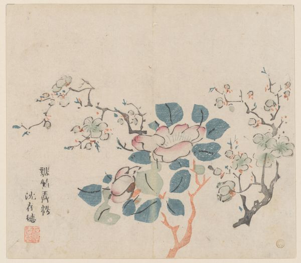
Editor: Here we have a page from the Ten Bamboo Studio Manual of Painting and Calligraphy, created in 1633. It was designed by Hu Zhengyan, and the medium includes painting, prints, ink, and paper, displayed in the Metropolitan Museum of Art. The flowers have this very delicate quality, almost ephemeral. I’m curious, what is your eye drawn to within this composition? Curator: Formally speaking, the composition strikes me with its dynamic interplay between realism and abstraction. Consider the rendering of the leaves: blocks of muted green defined by simple outlines. And consider the flowers which presents a juxtaposition; they are detailed and fragile. Note the strategic placement, how these forms engage negative space to create visual tension. Does the spatial organization suggest a hierarchy of forms to you? Editor: I see what you mean; the weight is in the lower part of the sheet, almost tilting. And to answer your question, I think that my eyes immediately search the brightest, more complex form, that one pink flower, before I examine the other details. Curator: Precisely. Note also how the limited color palette--greens, browns, pinks--further contributes to the visual harmony. The restrained use of color amplifies the importance of line and form, which in turn creates a viewing experience dependent on compositional analysis. The visible woodblock-printing is clearly deliberate to produce such soft colors in what is normally seen as an accessible craft. What conclusions can you draw about its design? Editor: It feels almost as though it rejects rigid naturalism. It prioritizes conveying the essence of a natural form through mindful arrangement, colour, and considered brushstrokes. Curator: I find your observations astute. The piece showcases the visual sophistication achievable through seemingly simple means. Its beauty resides in the careful attention to form and arrangement, and it exemplifies an understanding of less is more. Editor: Thank you. This exercise was extremely valuable in showing the importance of closely analysing the internal aspects and construction of the piece, and using those observations as a means to understanding it.
Comments
No comments
Be the first to comment and join the conversation on the ultimate creative platform.