drawing, graphic-art, print, typography
#
drawing
#
graphic-art
# print
#
book
#
typography
#
11_renaissance
#
typography
#
geometric
#
geometric-abstraction
#
italian-renaissance
Dimensions: 11 5/8 x 8 1/4 x 1 1/4 in. (29.6 x 21 x 3.1 cm)
Copyright: Public Domain
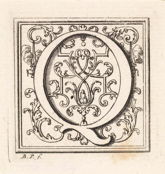
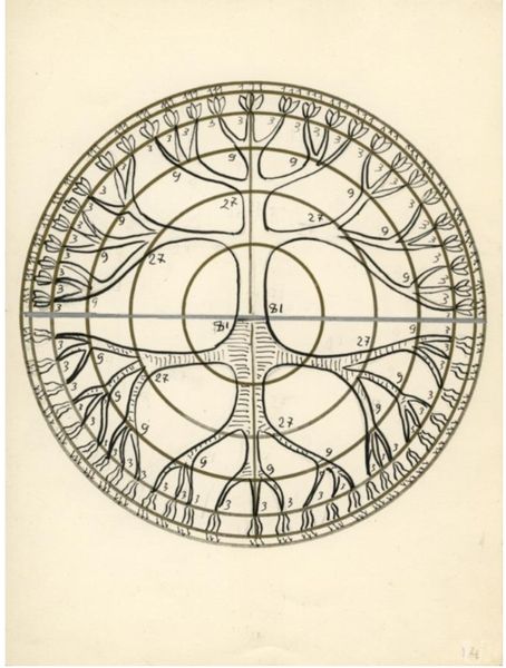
Curator: We’re looking at a print titled "Divina Proportione," dating back to 1509 and attributed to Leonardo da Vinci. Editor: It’s immediately striking – almost severe in its graphic precision. The thick lines forming the ‘M,’ contrasted with those precise circles, give it a calculated, almost cold feel. It evokes authority. Curator: Indeed. "Divina Proportione" isn’t just a standalone image; it’s actually part of a larger book on mathematical proportions, a subject that deeply fascinated Renaissance artists. Da Vinci wasn't just rendering a letter; he was dissecting its geometry. We have to remember the rising importance of print and the new ways information was being circulated and controlled. Editor: Precisely. And this isn't just about the aesthetics of geometry. The Renaissance obsession with proportion was inextricably linked to power structures, religious symbolism, and a belief in universal order. The 'M', constructed with such deliberate care, becomes a symbol of these systems, perhaps an attempt to materialize and rationalize control through typography. Curator: Right, you see that deliberate labor. It highlights the interplay between artistic expression, technological innovation, and intellectual pursuit. You've got the artist, the mathematician, the printer—all collaborating, using tools like compasses and printing presses to bring this concept of divine proportion to life, to physically manifest an abstract idea in material form. The print allows for reproducibility, democratizing access to the ideas. Editor: Yes, but the very act of defining the ideal 'M' also implies exclusion and standards. There’s power in determining what is proportionate and beautiful. Even the circulation of this printed book has inherent social and political implications - access, literacy, education; these all contribute to a hierarchy. This ‘M’ isn’t simply a letter; it's a manifestation of broader cultural norms and inequalities. Curator: I agree. Considering those dynamics adds significant layers to what appears initially as simply a mathematical or artistic exercise. Editor: Absolutely. This artwork encourages us to reconsider how seemingly neutral or beautiful forms can uphold implicit social and power systems. A provocative thought as we turn our attention to the next piece.
Comments
No comments
Be the first to comment and join the conversation on the ultimate creative platform.
More like this